Crypto
DeCharge
Branding, marketing & social assets created for the Solana DePIN project DeCharge
DeCharge is a decentralized EV charging network built on Solana. Powered by DePINFi, it lets EV drivers charge
anywhere while empowering people to own, host, or invest in charging stations.
Following a brand refresh, their visual language needed to be updated across social platforms. I led the
creative development for this transition and built re-usable visual systems.
The First Challenge
When I first took responsibility for DeCharge, the brand refresh was still months away. There was no existing branding, system, or templates in place. Their X presence was bare-bones, featuring only the old logo.
With no time to develop a full brand system upfront, it became essential to build one iteratively, day by day. I started with the logo's existing color palette and, within a couple of weeks, established a functional brand system. This system was later expanded and evolved using Midjourney.
Assets for simple animated clips and emailer assets
The Second Challenge
The second challenge emerged when the brand refresh finally landed and I received the new brand assets. The direction was the complete opposite of what I had built so far. While the new branding was exceptionally well executed, it meant rethinking and rebuilding systems entirely within a new set of constraints.
I've always enjoyed a challenge, so I leaned into it. The refreshed identity was extremely chic and unmistakably premium, and I wanted to do it justice while still accounting for the speed required to produce daily assets. I returned to Midjourney to develop a new illustration style aligned with this direction.
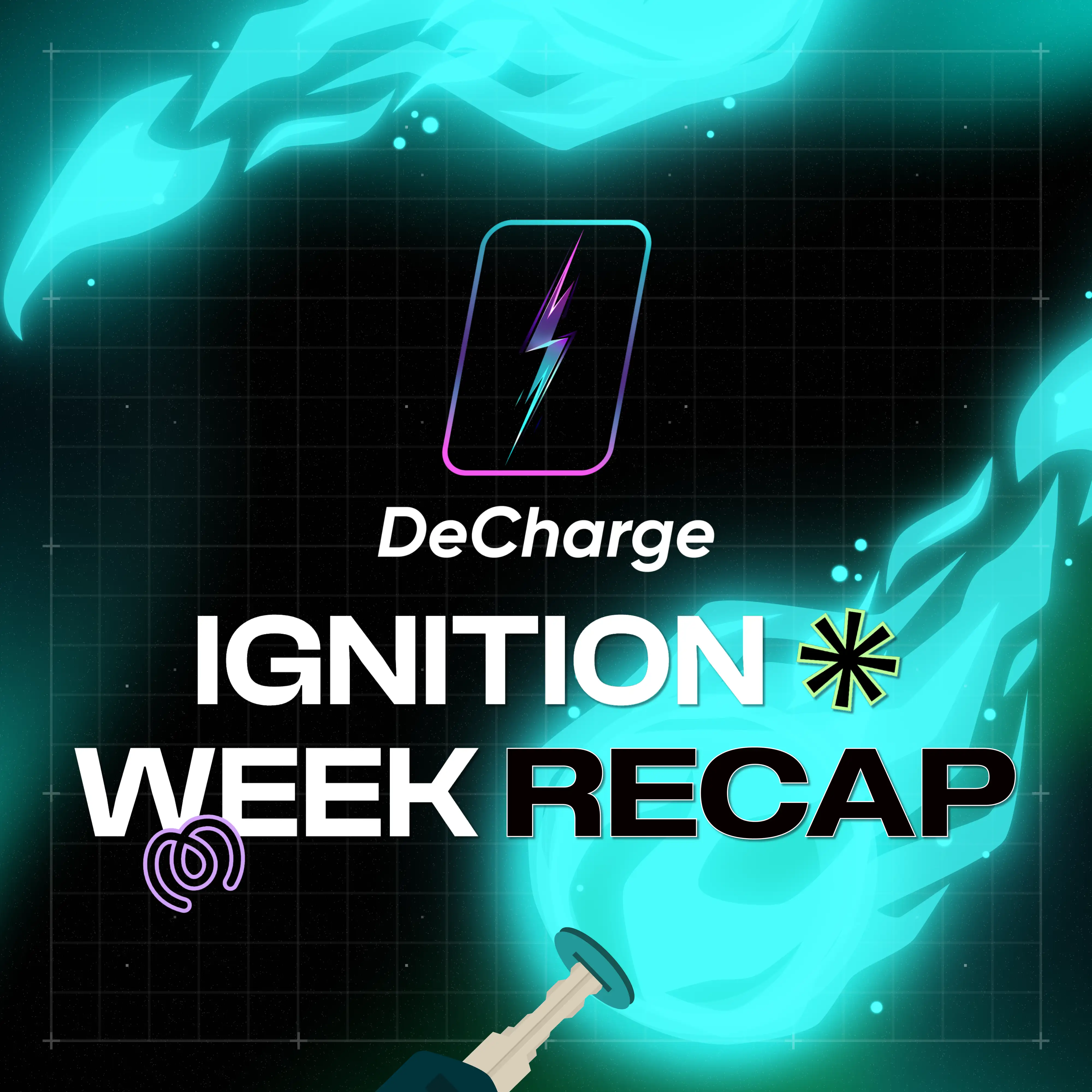
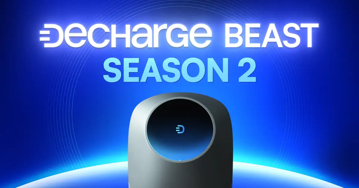
The result was a neo-futuristic illustration style, defined by a modern sheen and minimal elements, designed to scale quickly without compromising on quality.
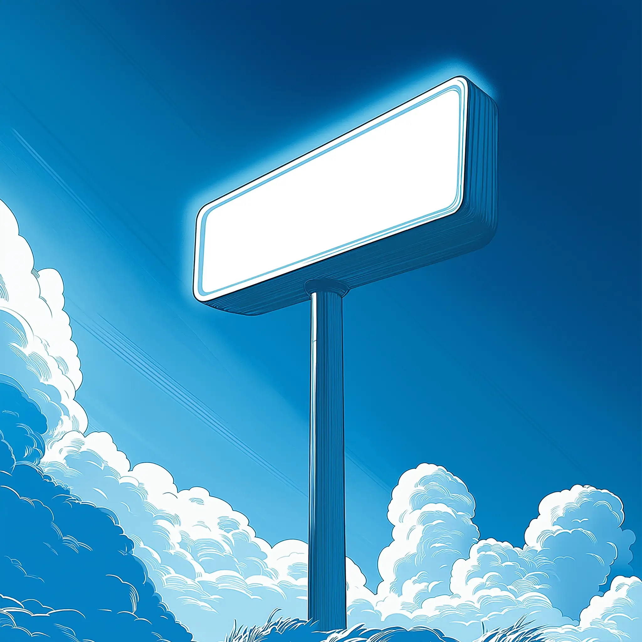
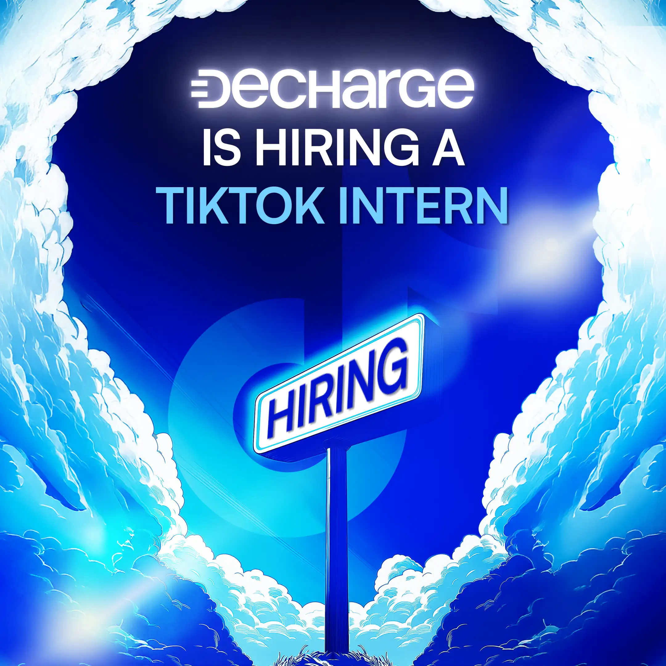
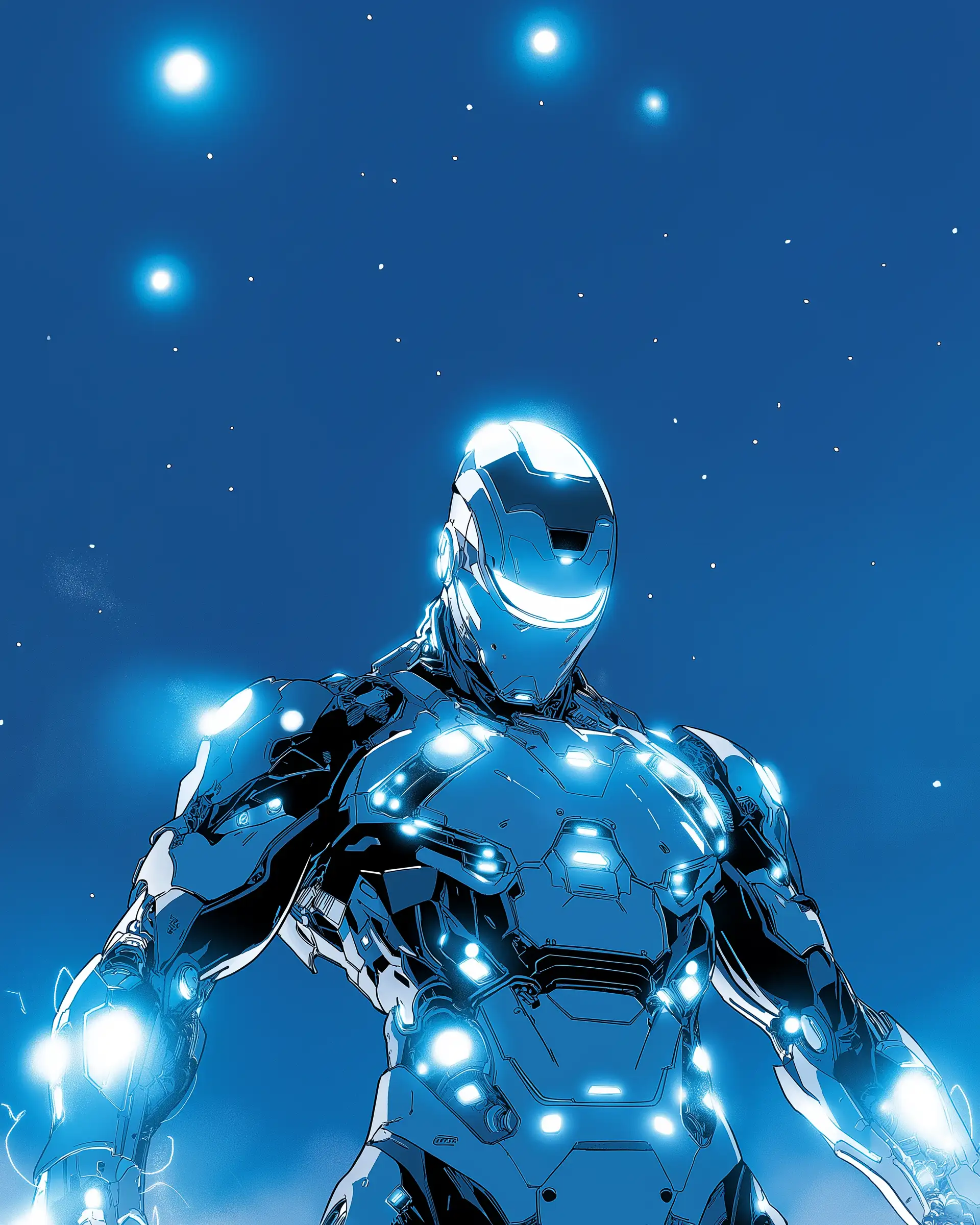
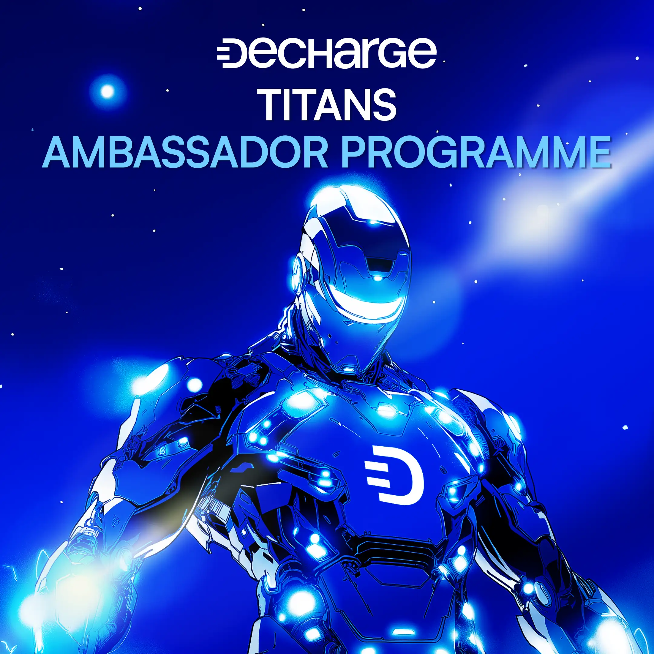
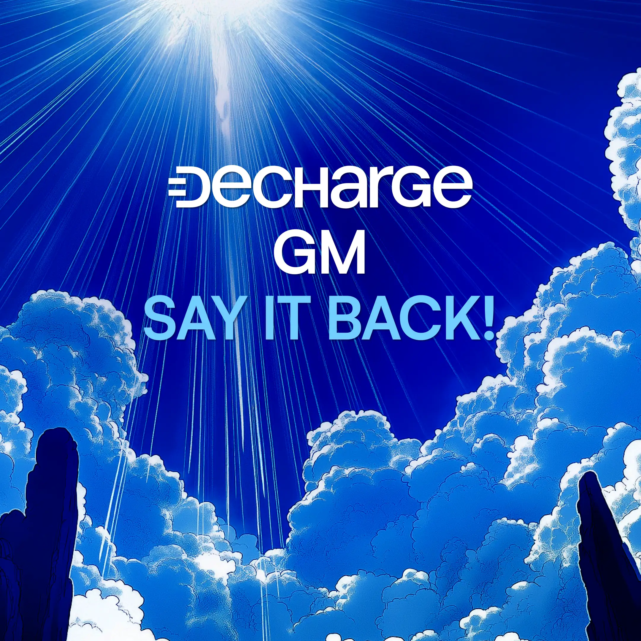
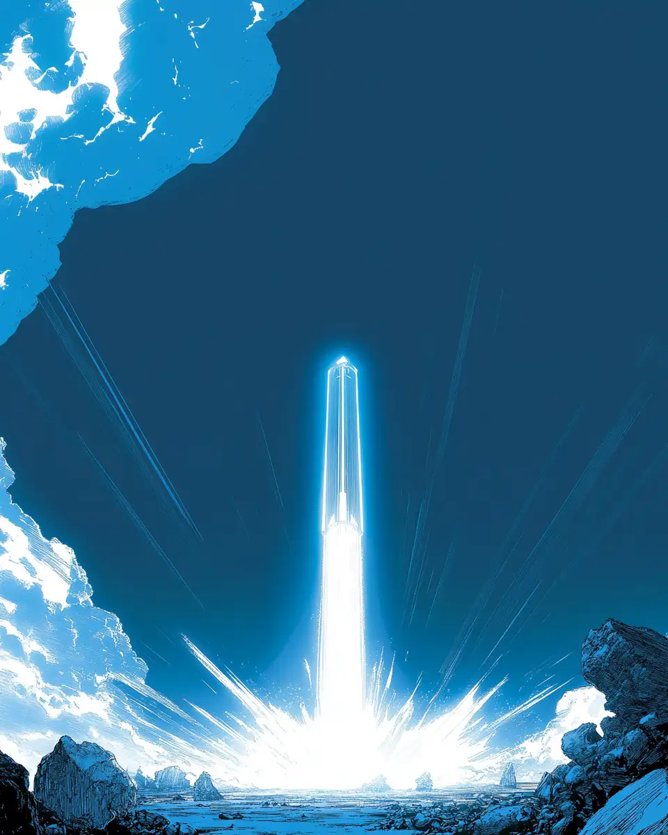
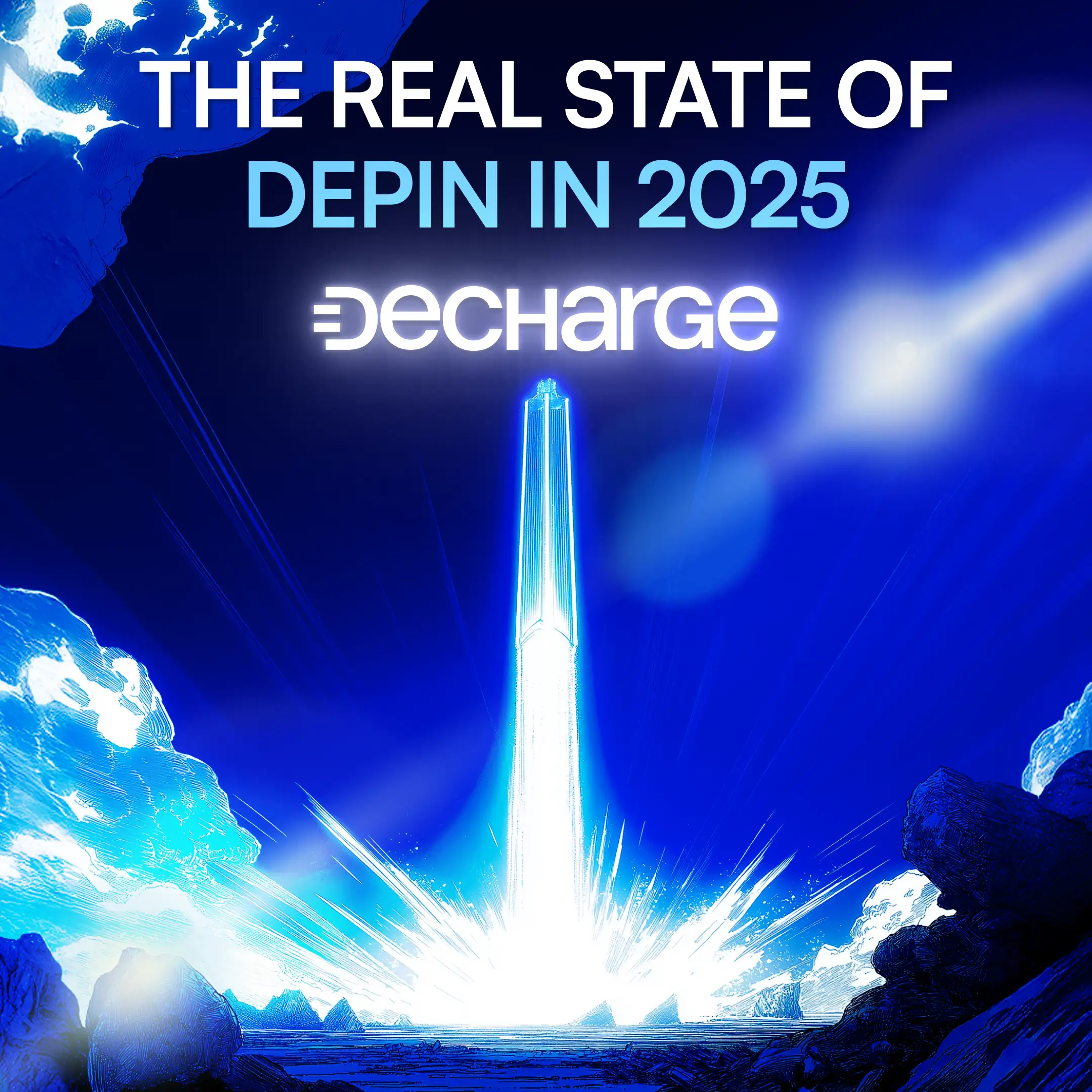
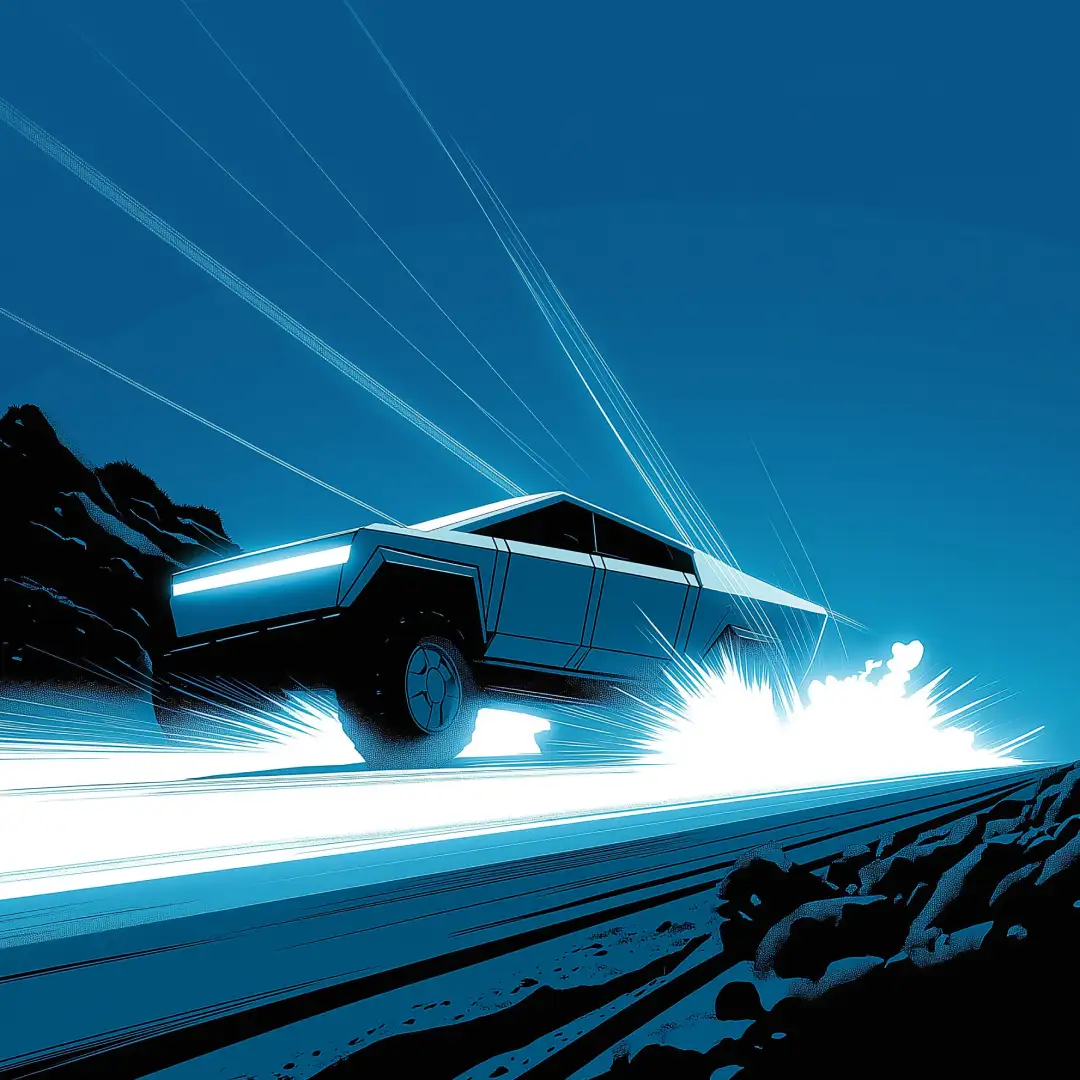
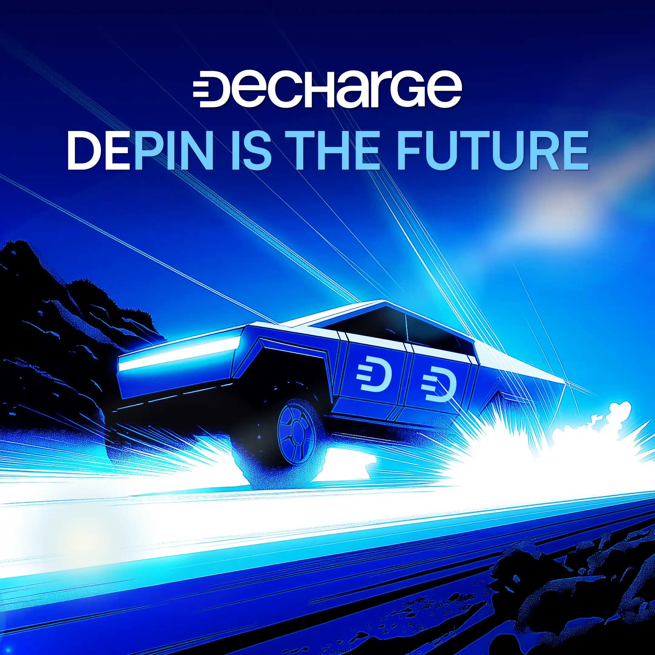
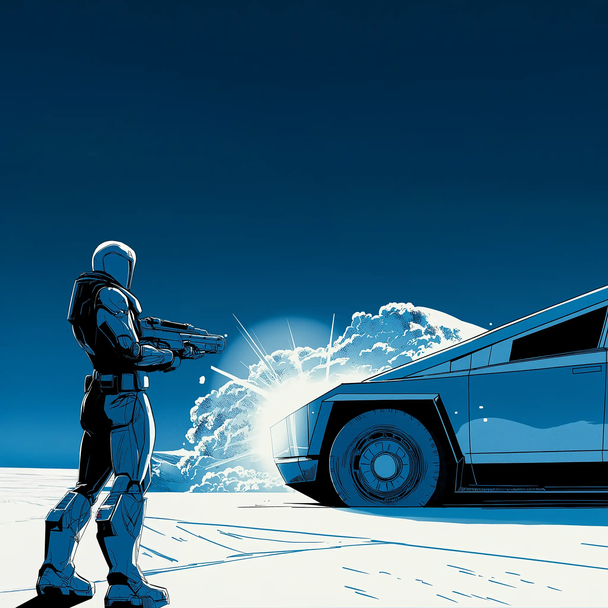
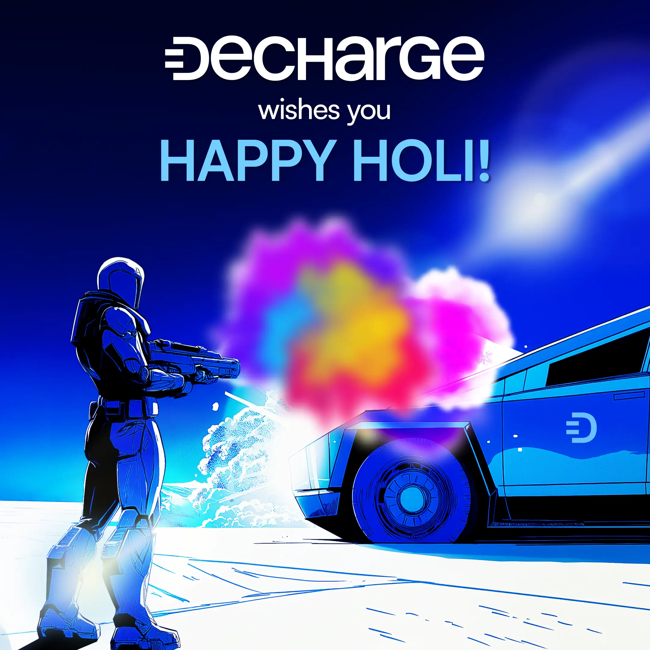
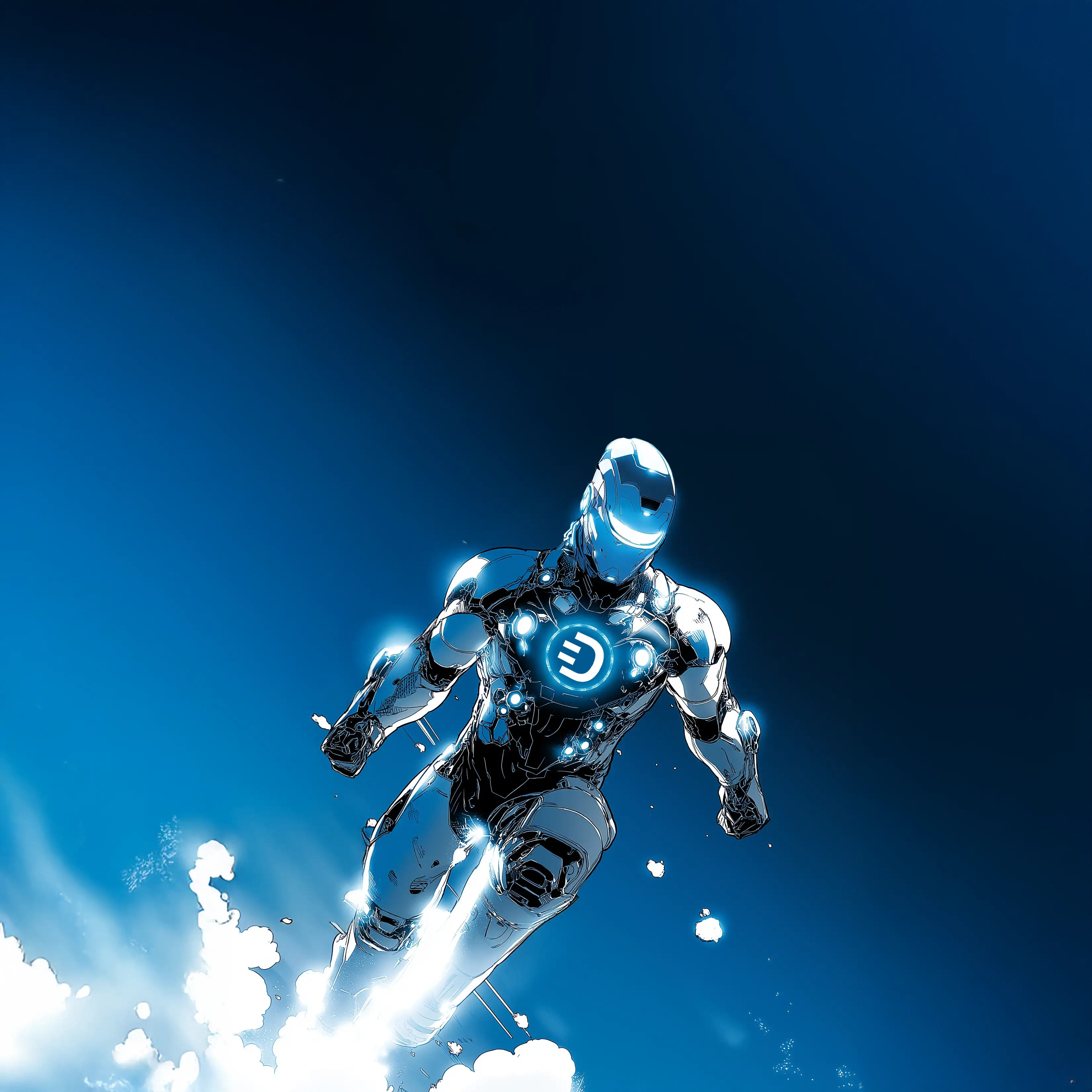
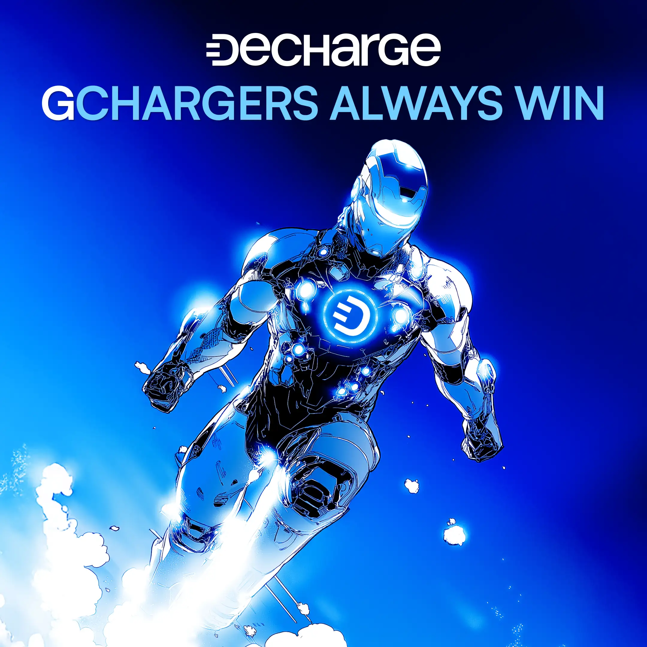
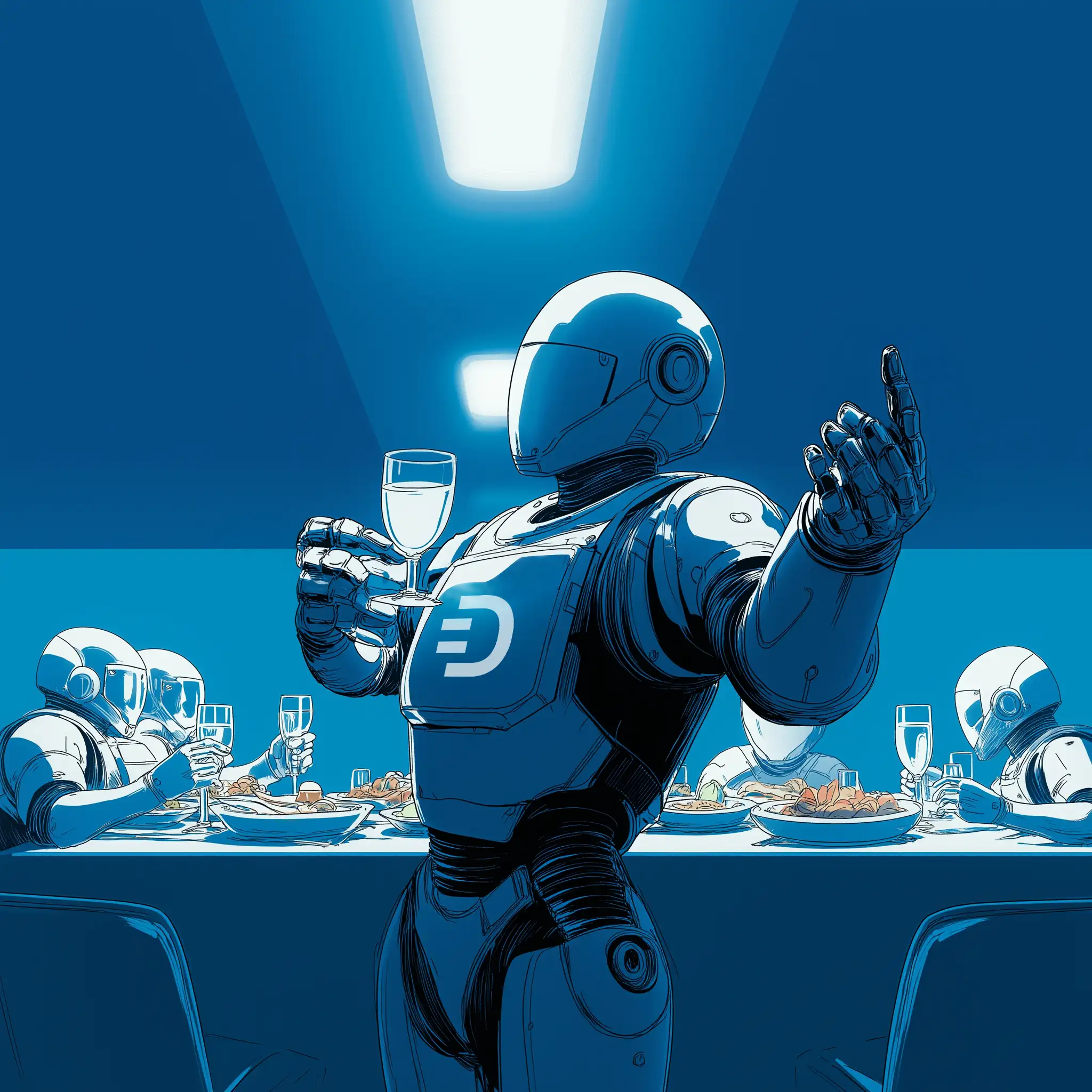
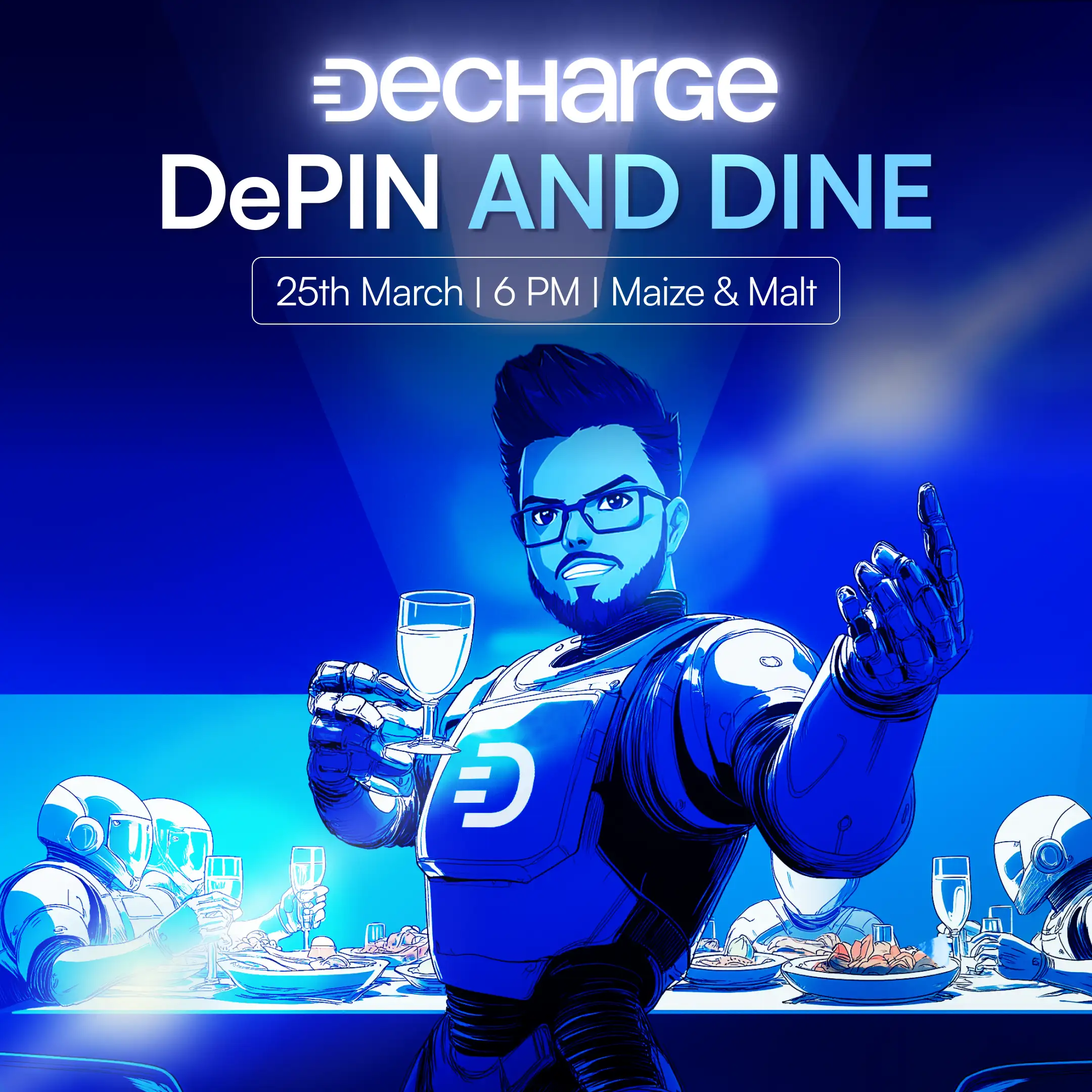
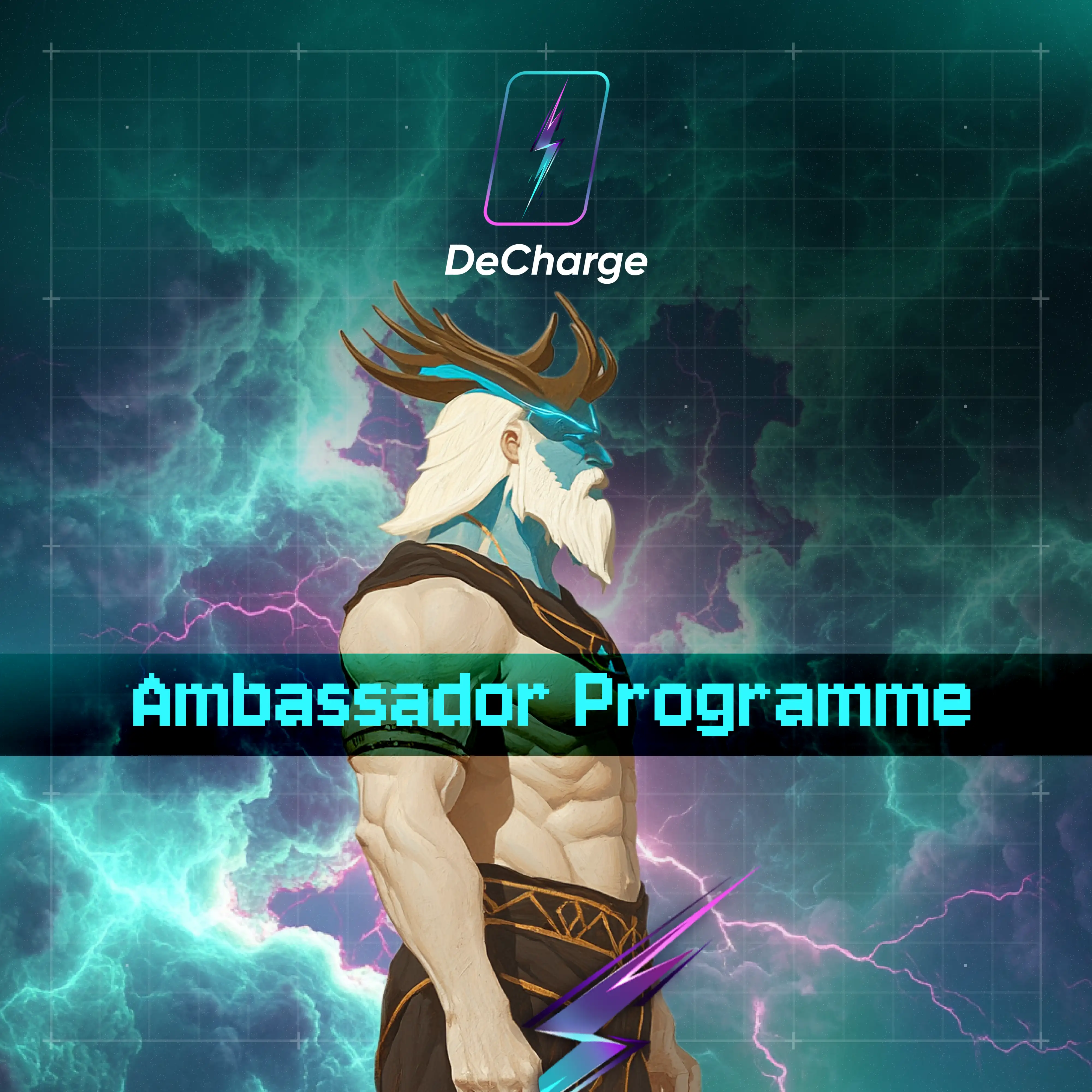
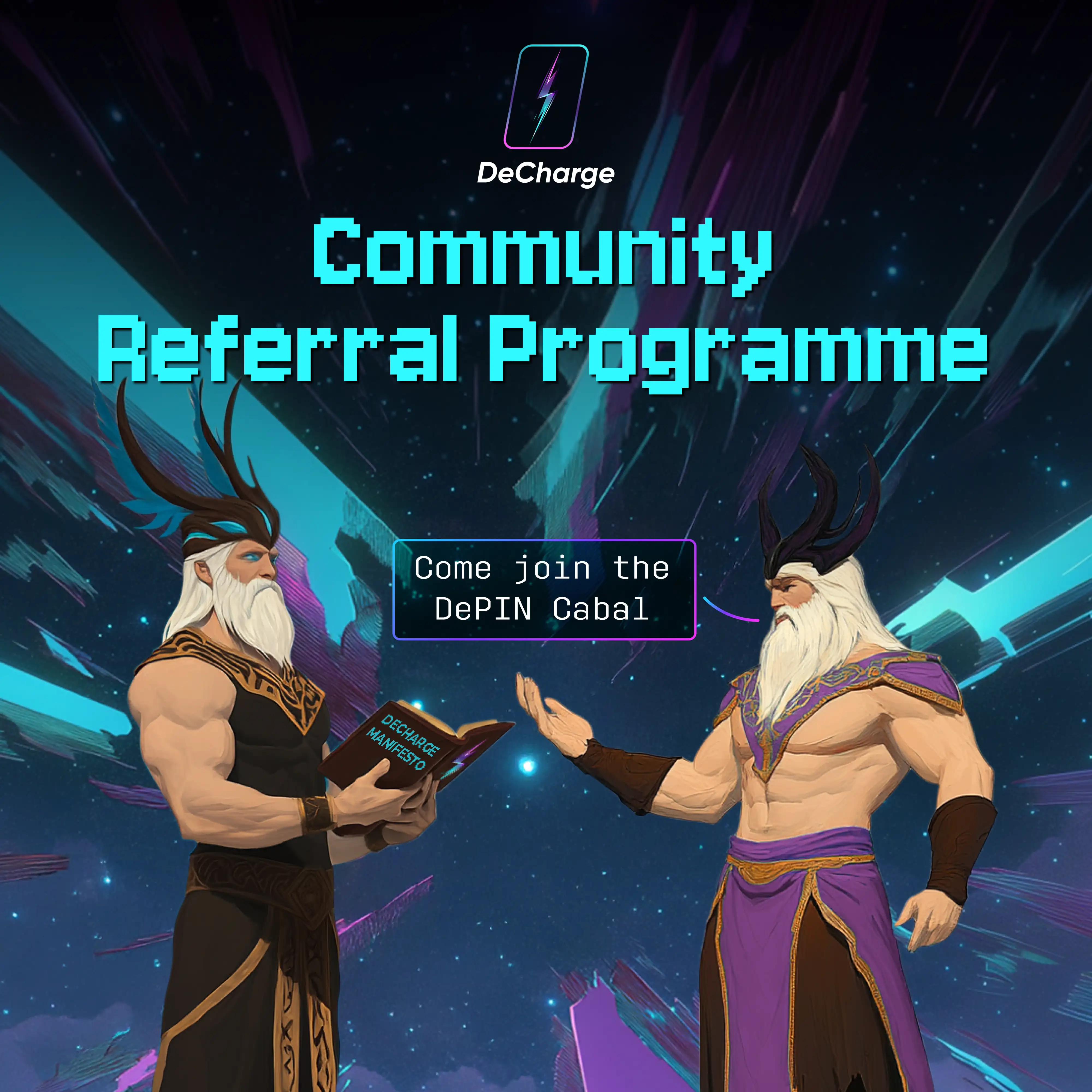
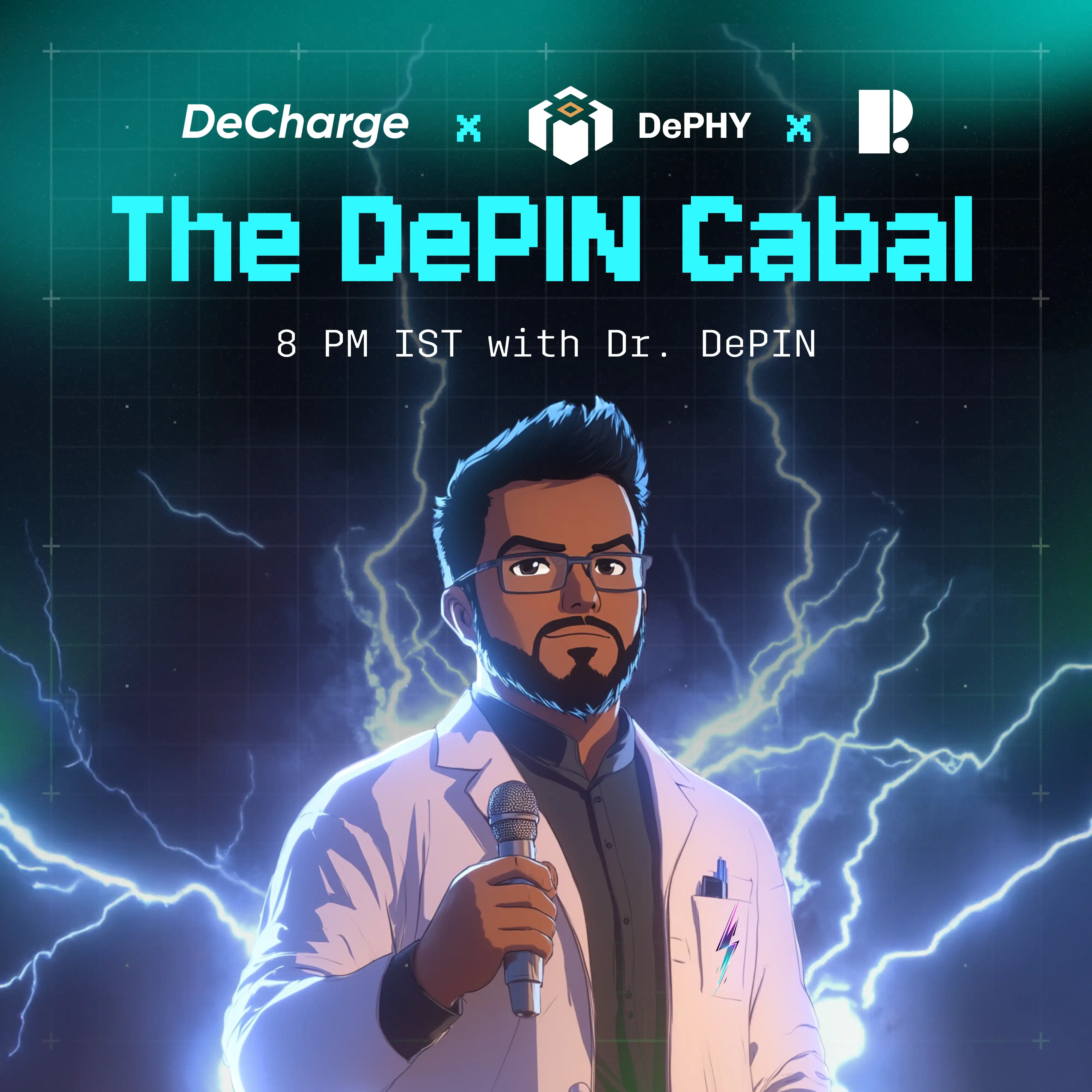
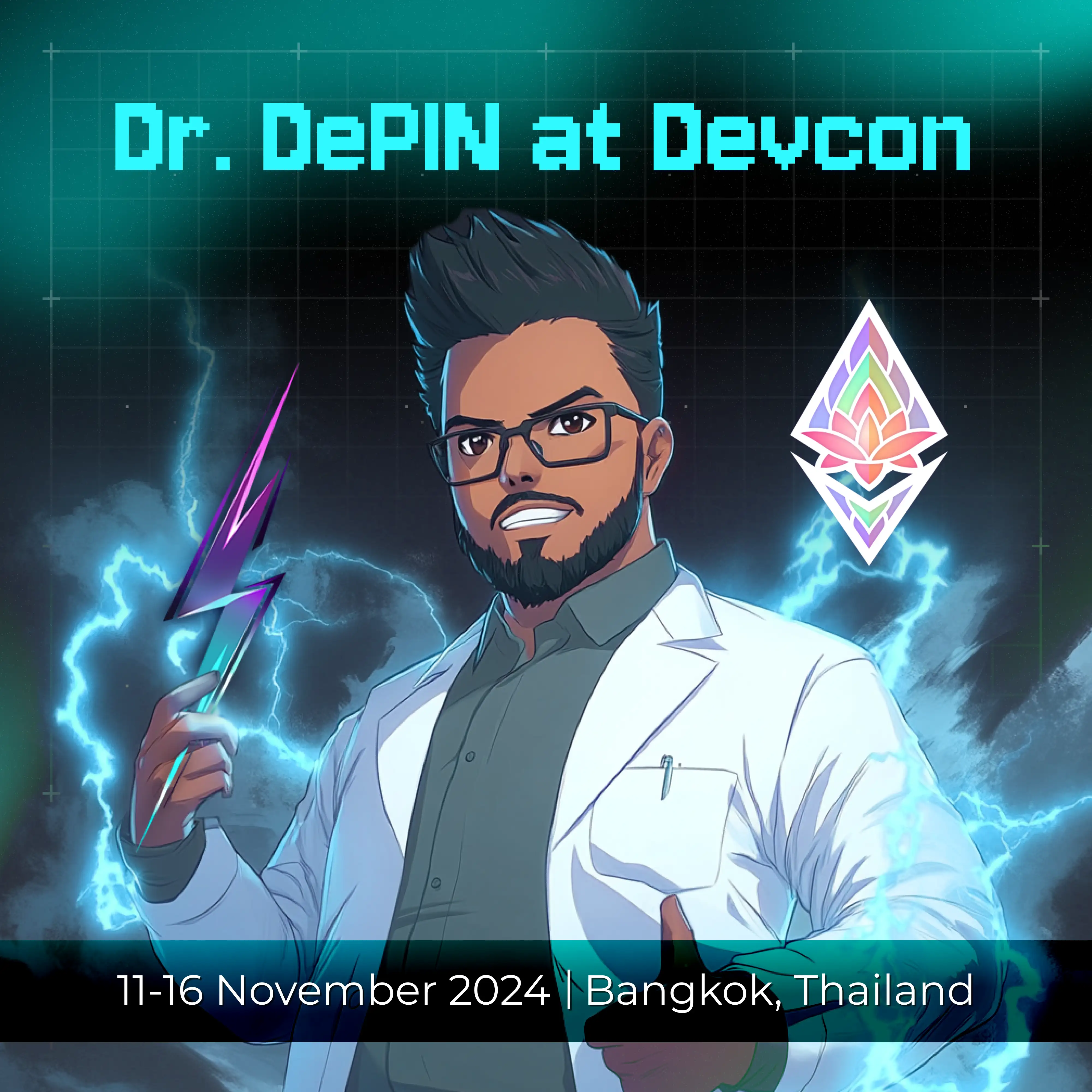
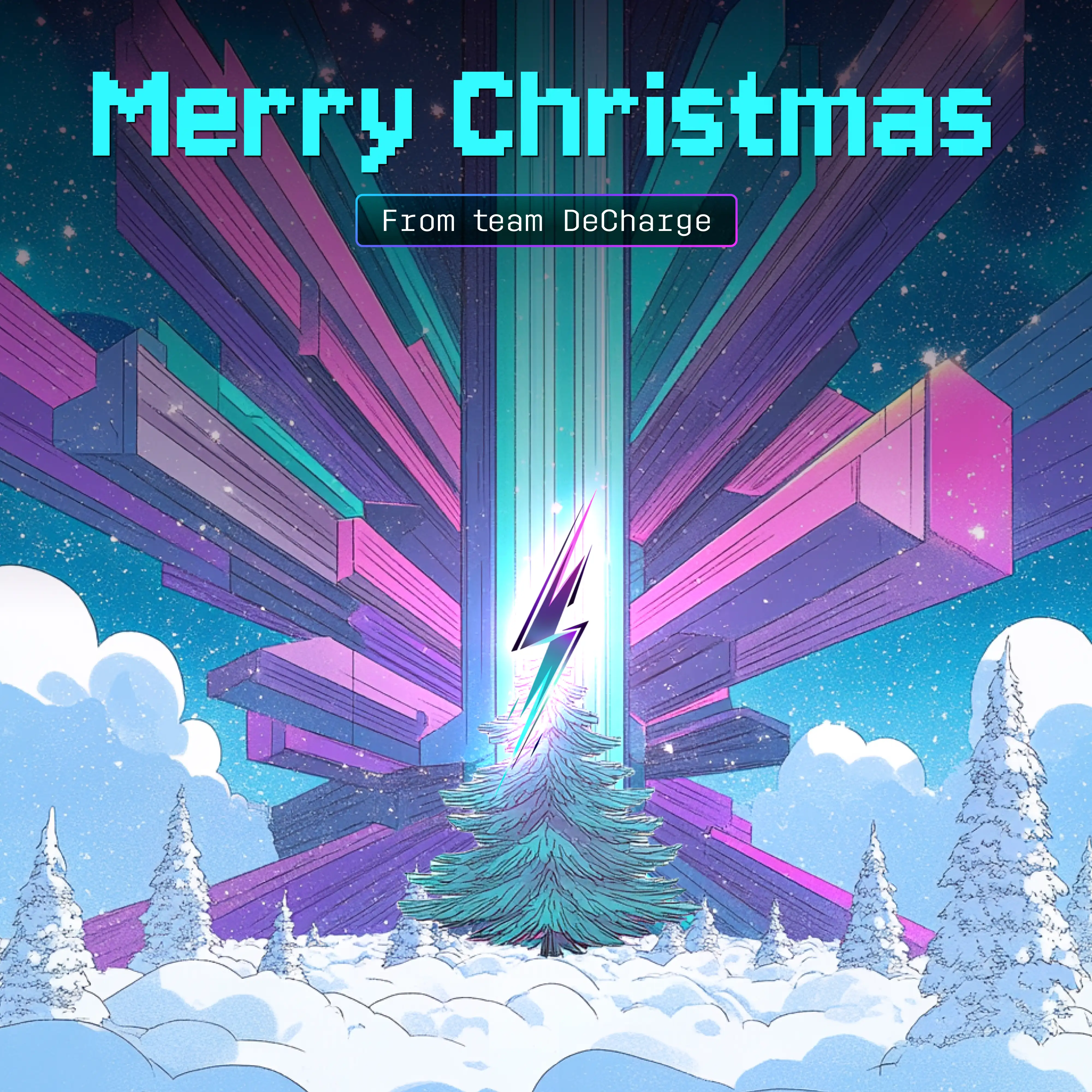
New Illustration Style Development
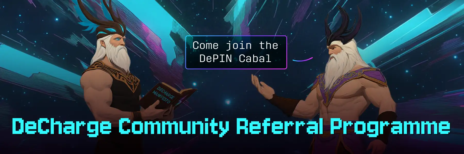
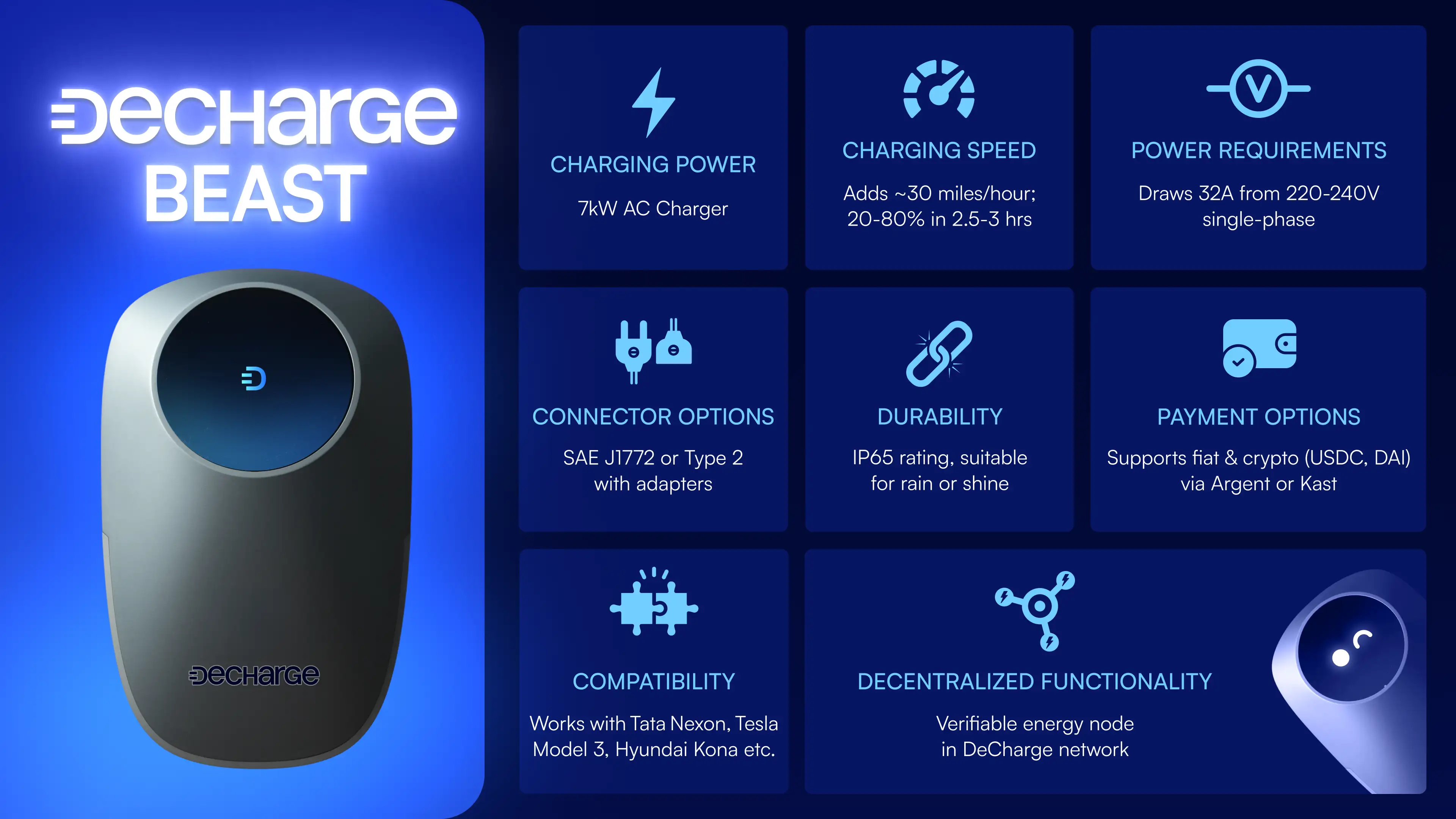
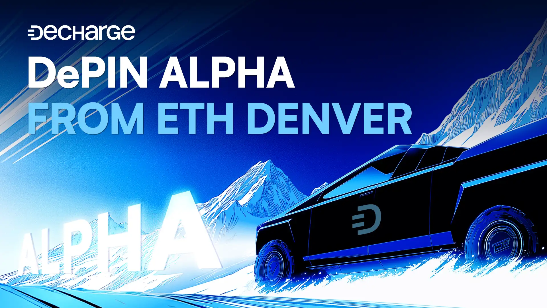
TTo support the refreshed brand direction, I developed a neo-futuristic illustration style built around rich electric blues and bold, titan-like characters. The visual language leans minimal yet powerful, using scale, contrast, and a refined sheen to establish a distinctly premium tone.
The goal was to convey strength, confidence, and technical sophistication while maintaining a polished, premium aesthetic. The examples below showcase how I generated the images and then used the rough visuals to polish and match the new branding.
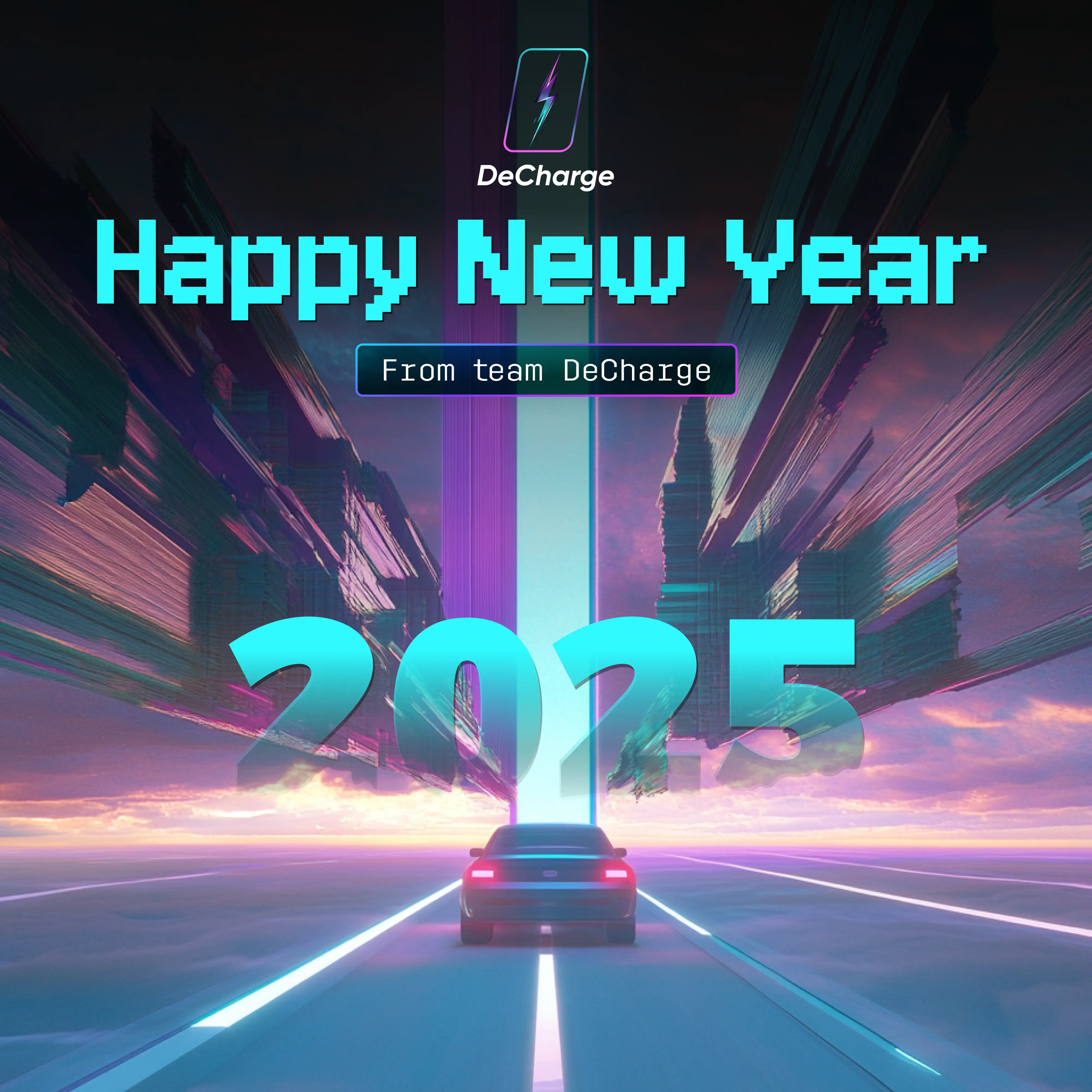
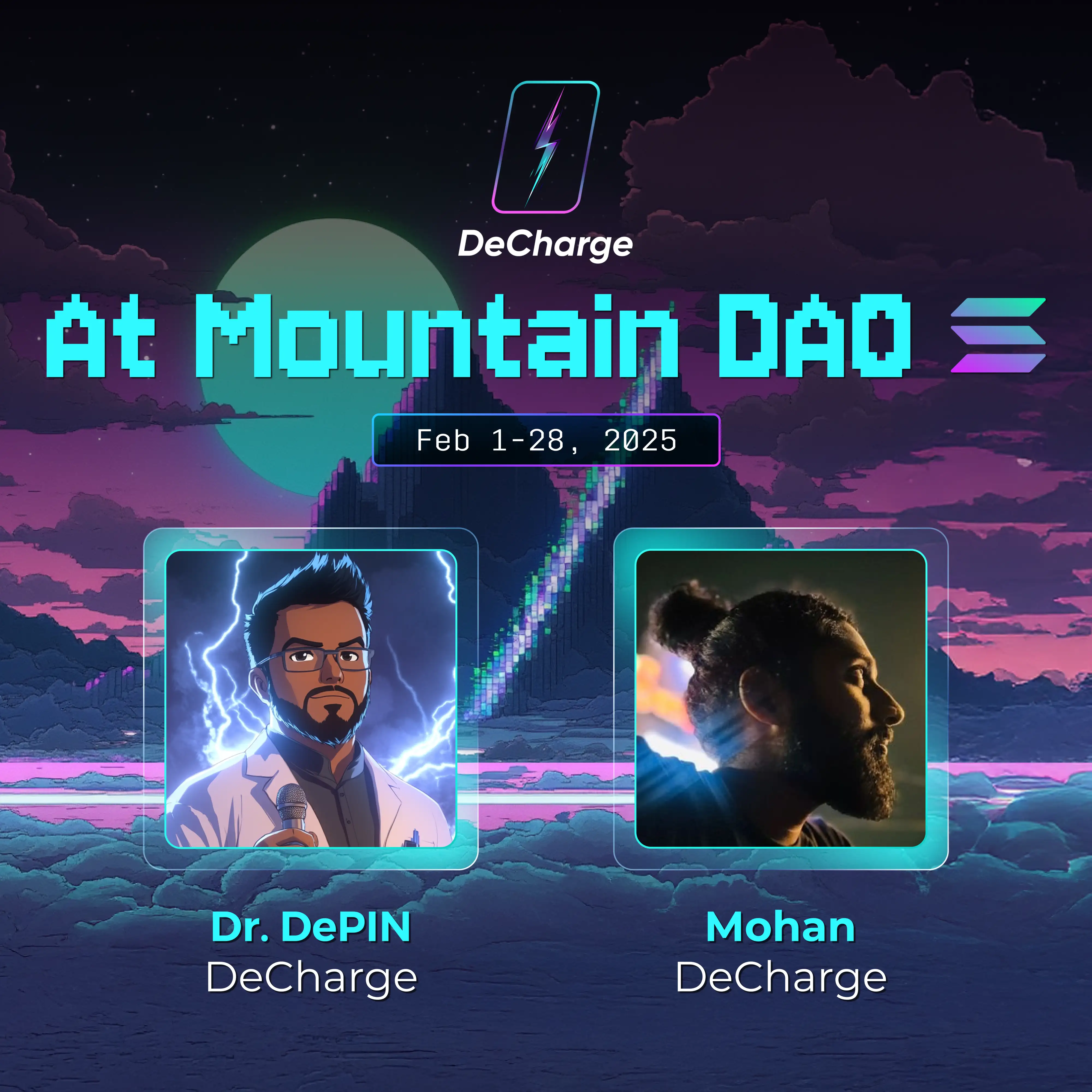
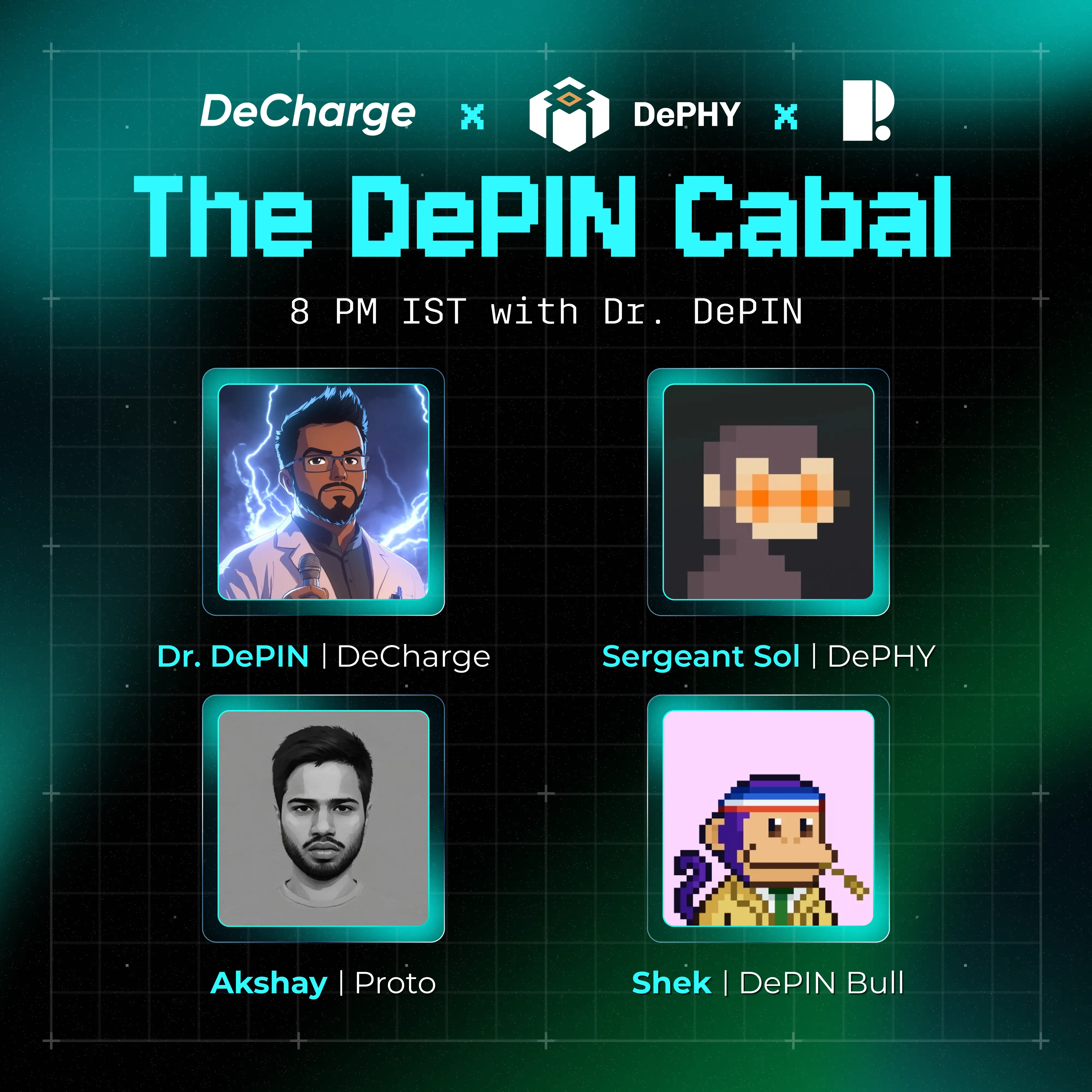
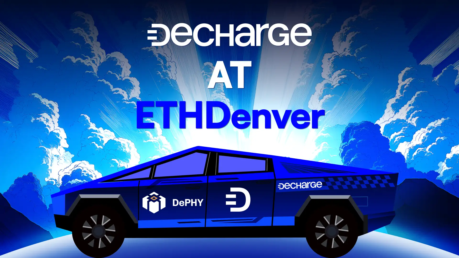
I extended this identity to the social posts for promoting the local, supporting acts as well.