Crypto
Base India
Visual systems & brand assets created for Base India
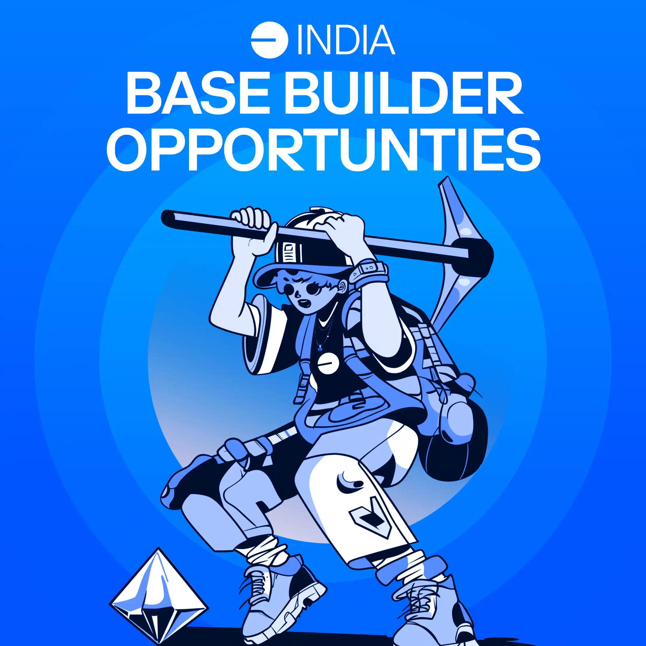
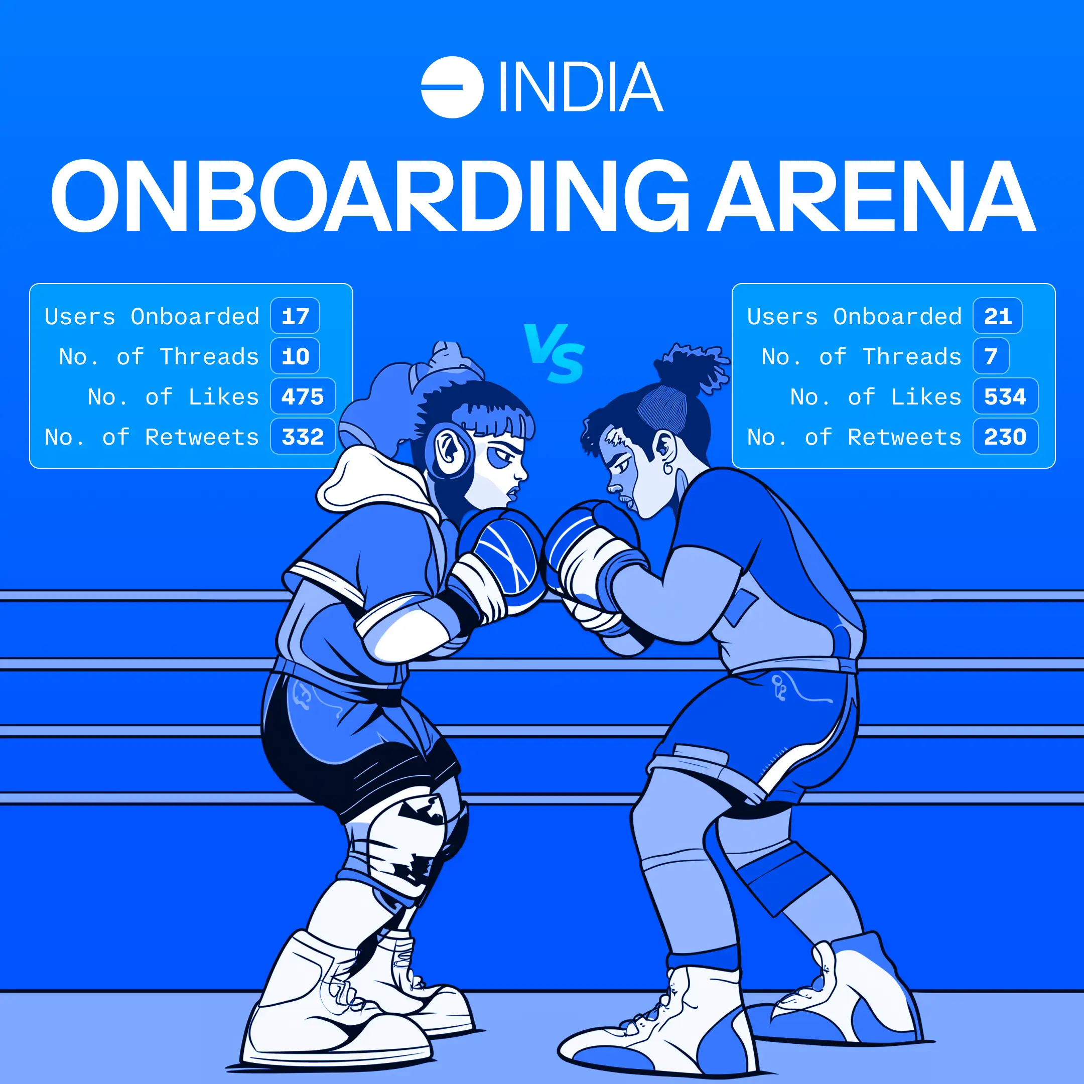
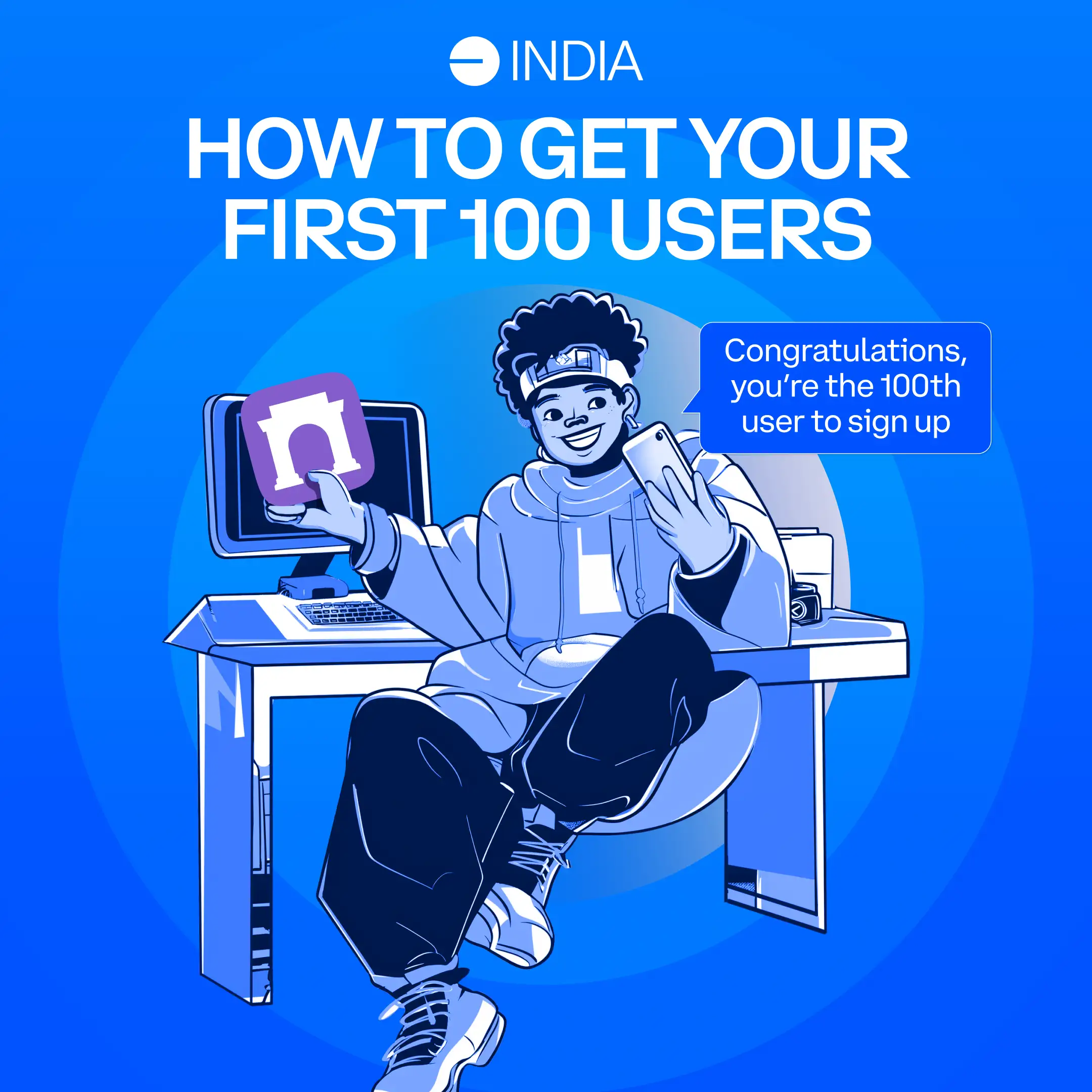
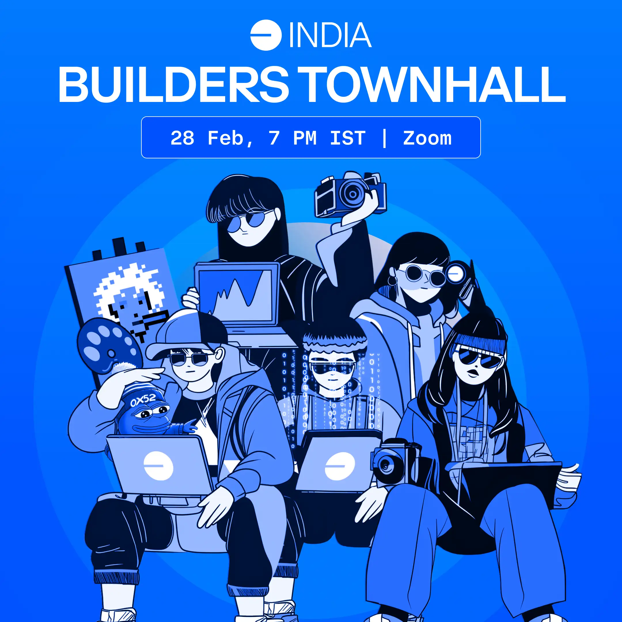
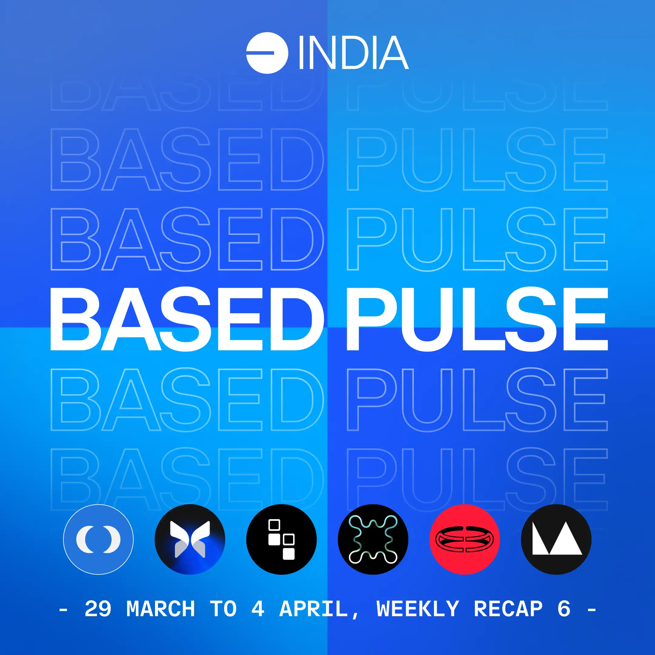
I led the creative strategy and built visual systems for marketing and socials that helped grew Base India's X presence from 0 to over 20k along with my incredible teammates working on their growth strategy. This involved logo designs, templates, assets for videos, merch and other print assets for in person events.
The Challenge
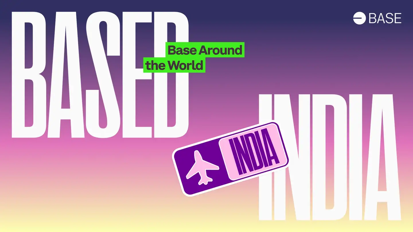
Every great project starts with a challenge. When I first came on to lend my expertise, Base India didn't exist. Base had just launched Base Around the World, and India was one of the participating regions (we joined the hackathon and won - more on that later!). This initiative became the catalyst for what would eventually become Base India.
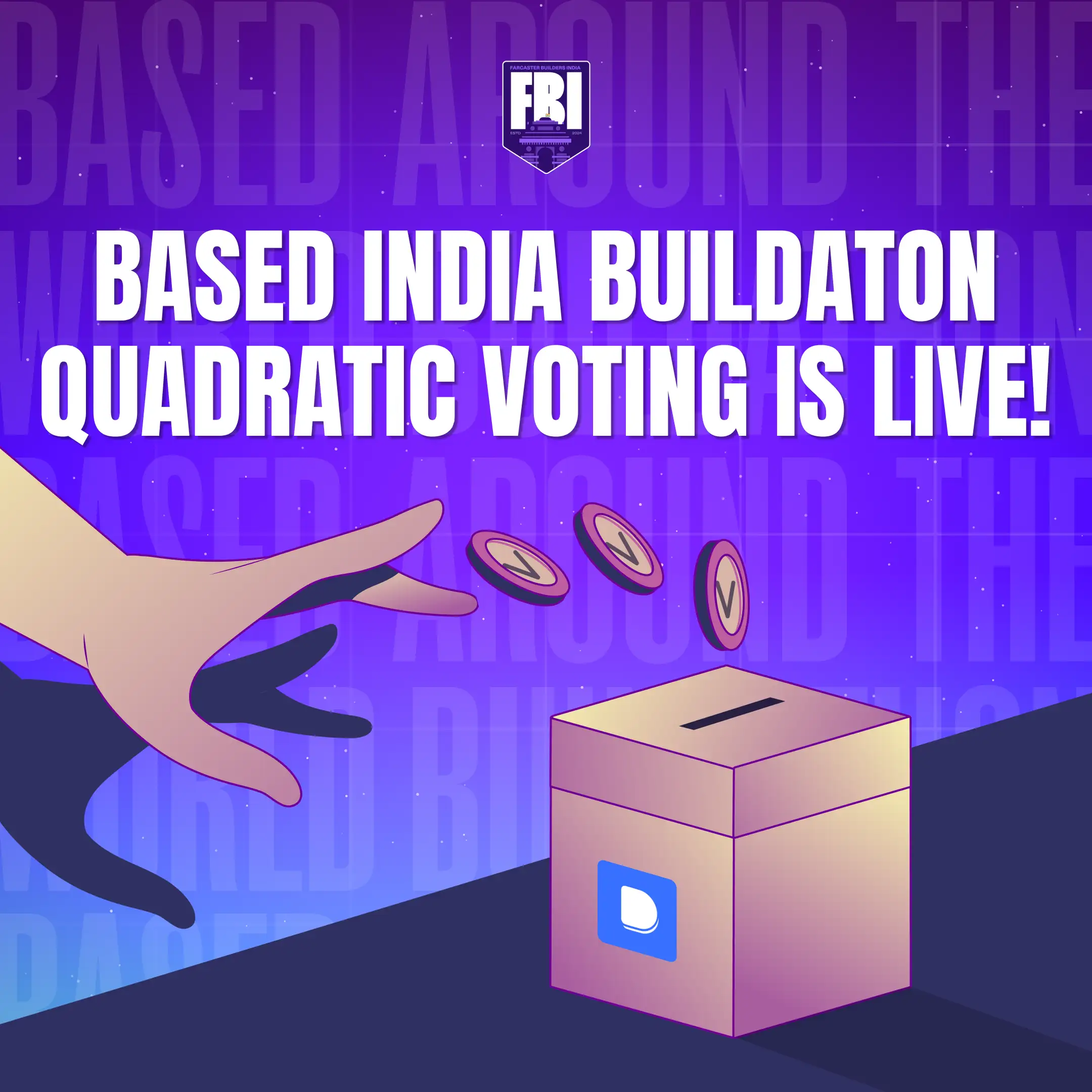
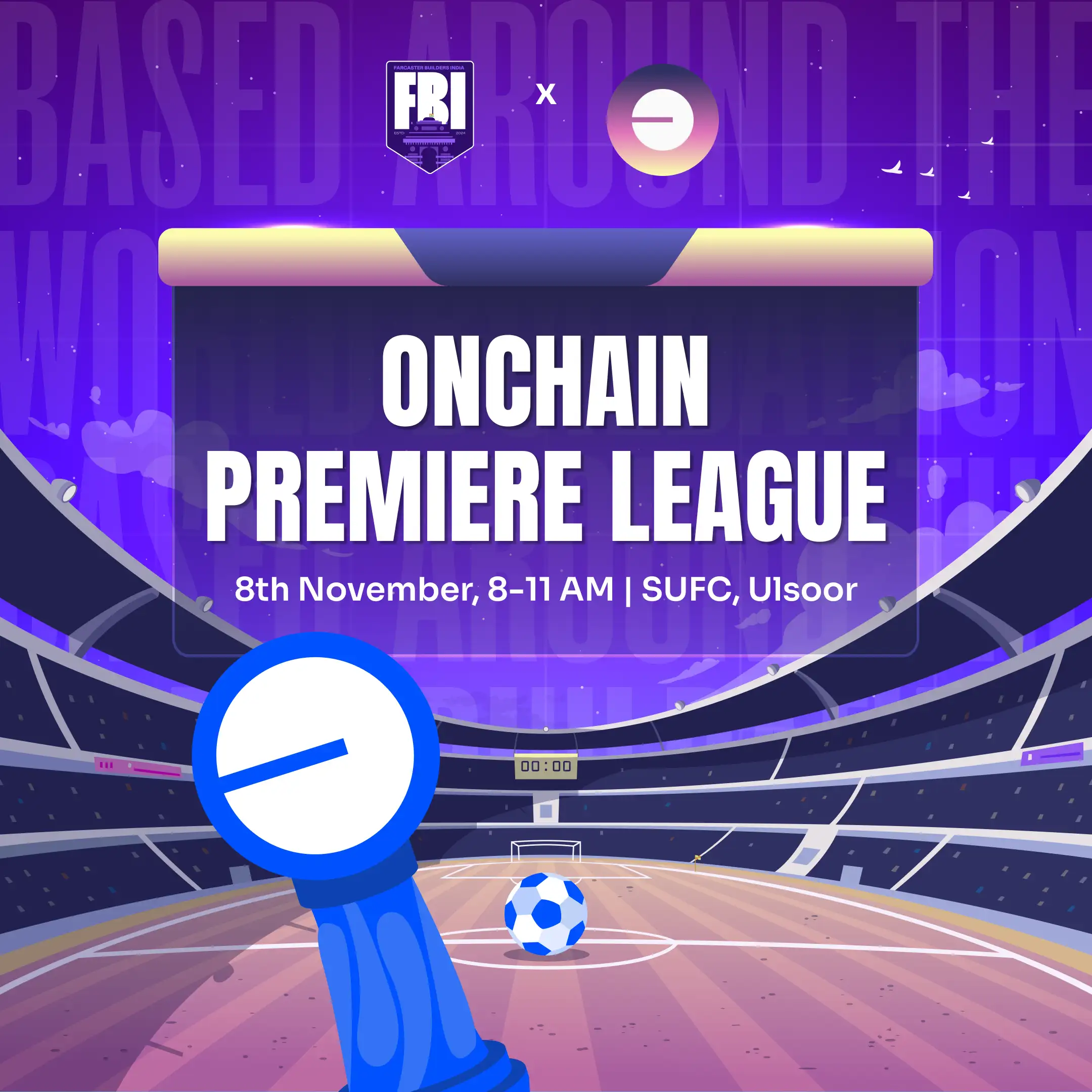
Due to compliance and legal guidelines, we couldn't brand Base India however we wanted. Instead, we had to work within the branding elements assigned to India at the time, which looked like this.
Design Process
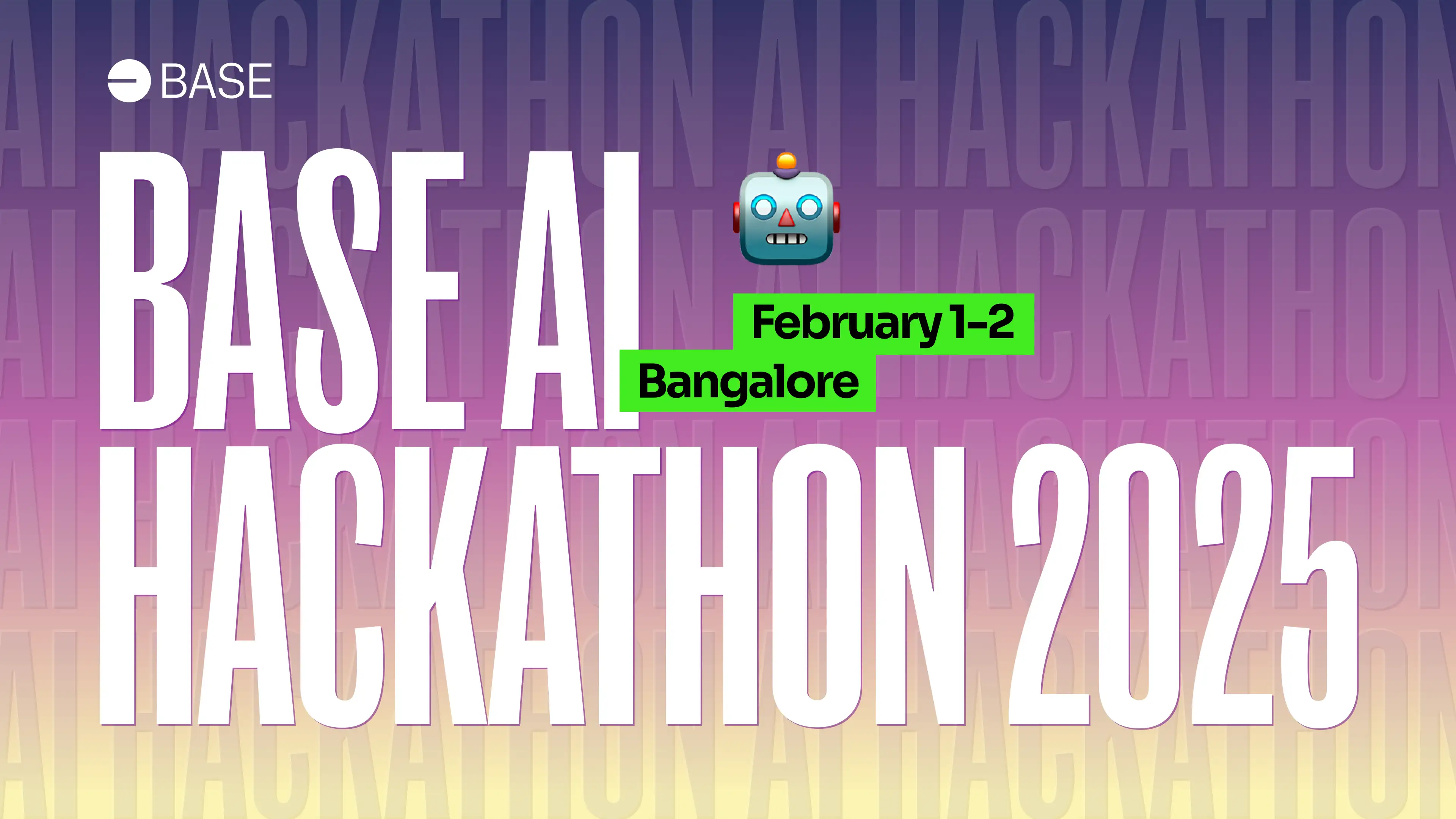
We went through many iterations of the same design base for socials, hackathons,
in-person events, print and other marketing efforts.
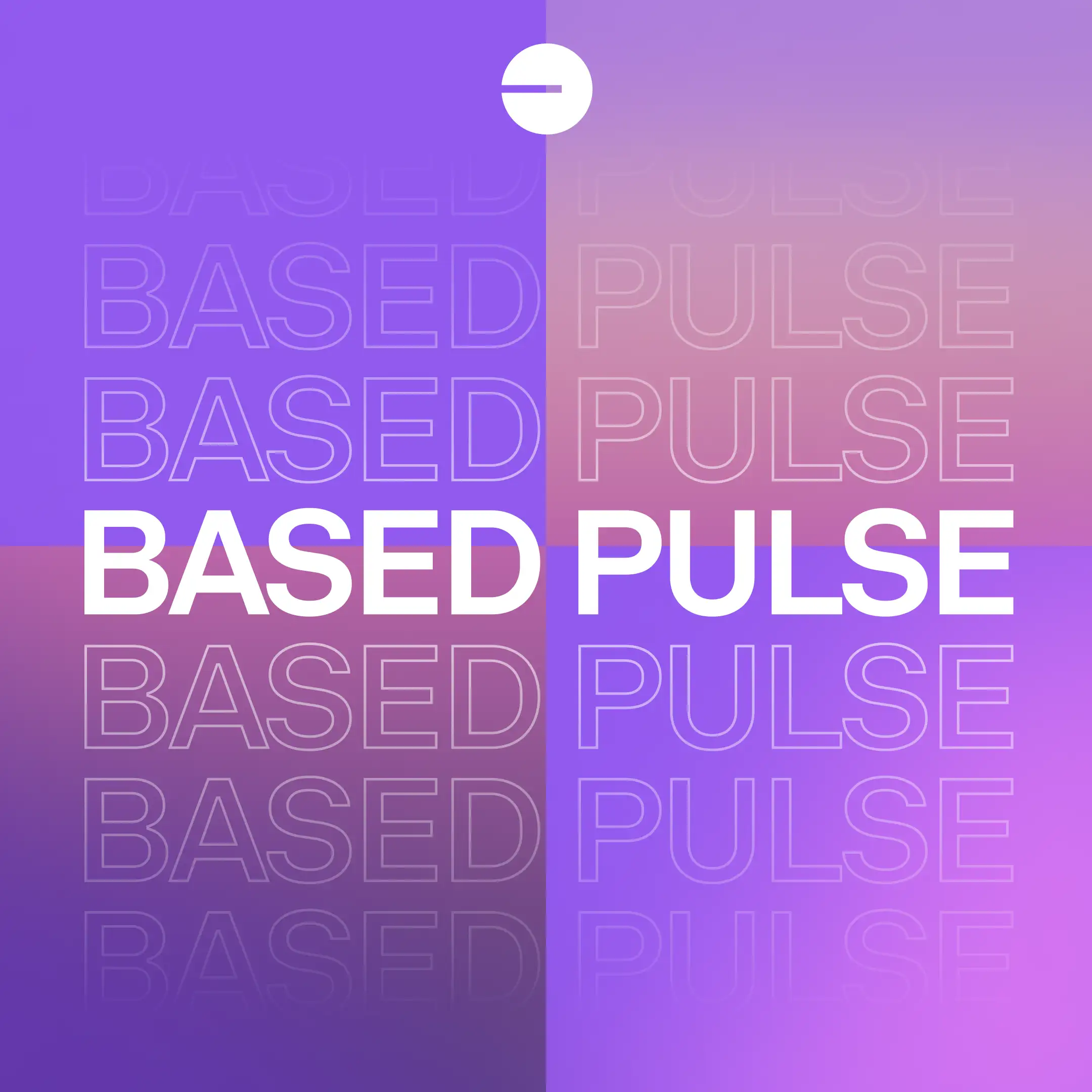
Design Evolution
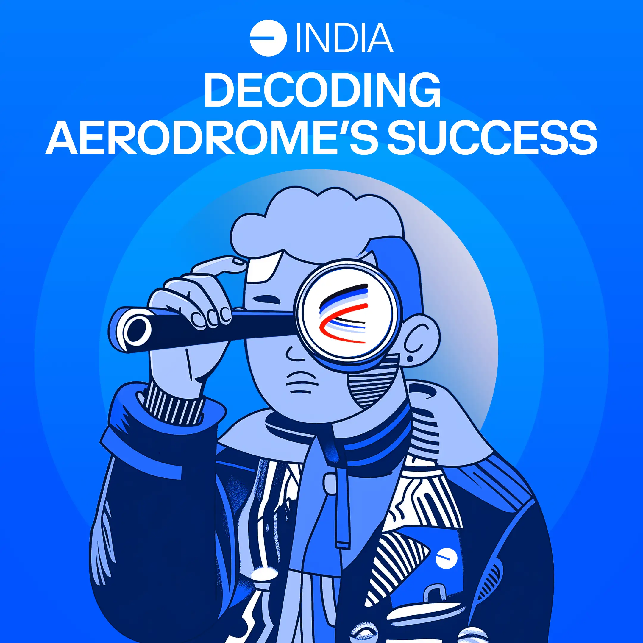
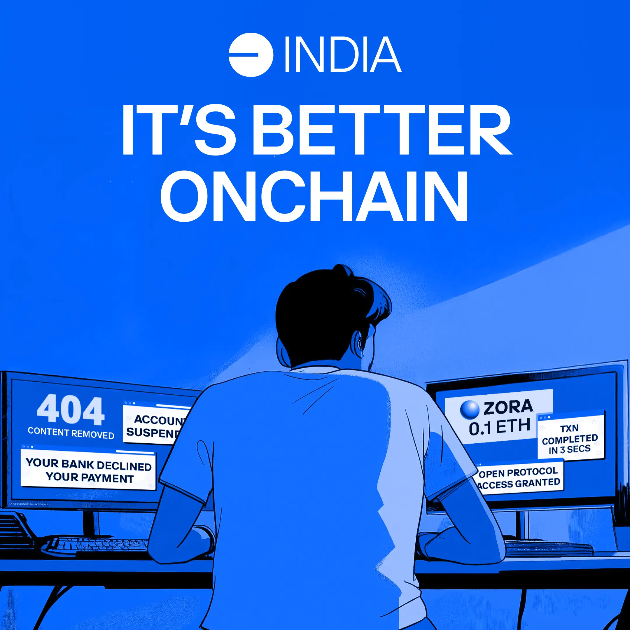
We finally were able to get the green light from Base to move onto a more cohesive branding aligned with the parent branding.
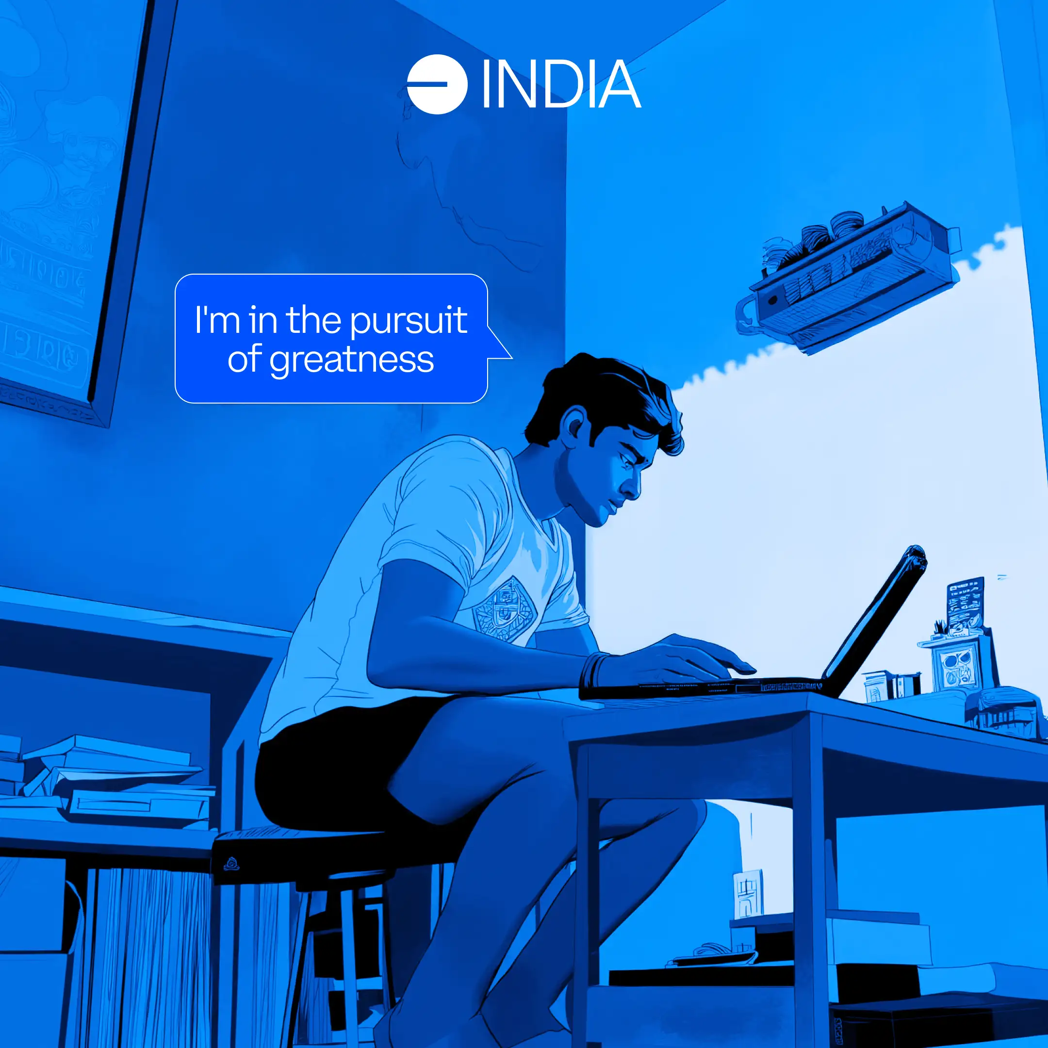
I was also getting tired of the purple gradient and didn't think it did us any justice.
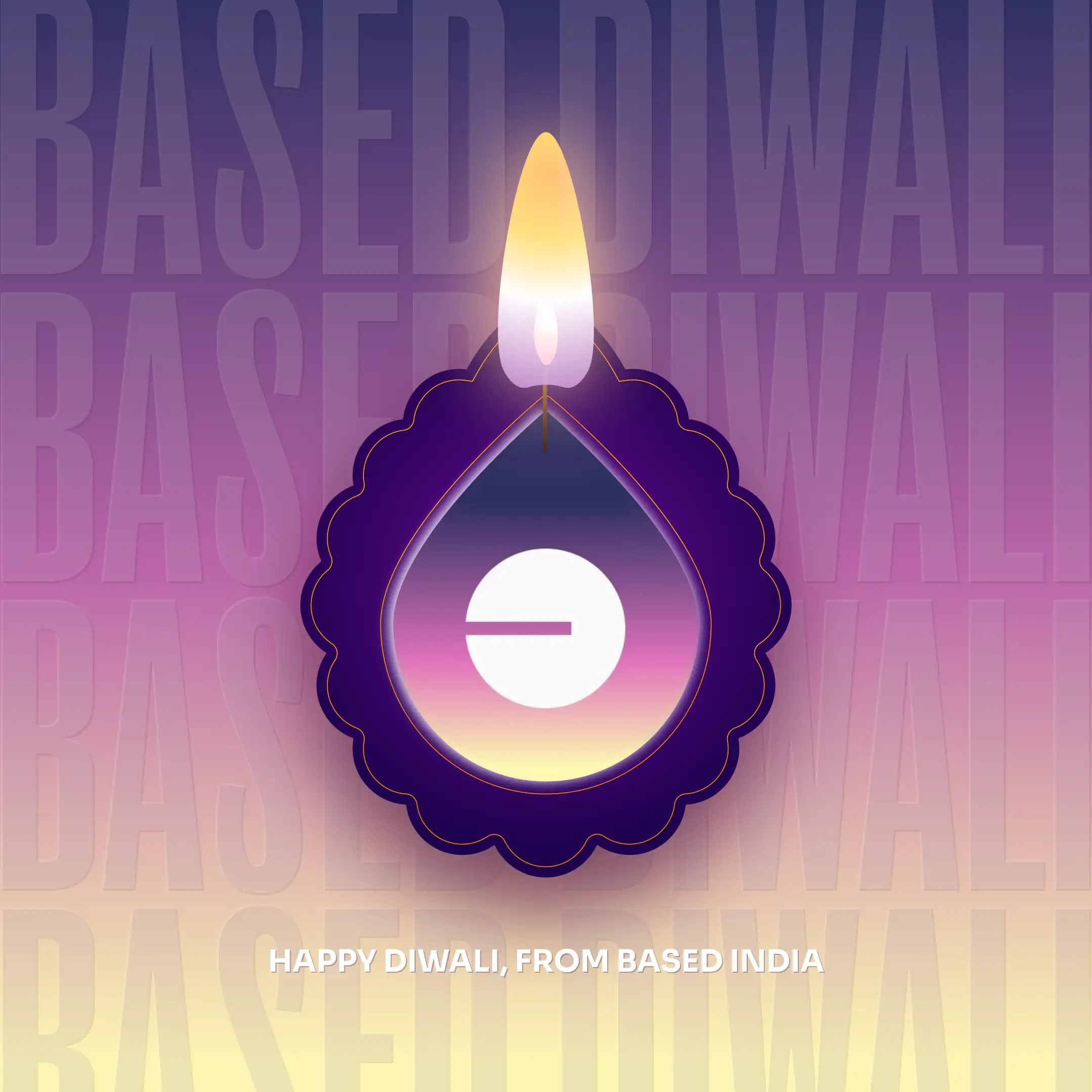
I finally got to do what I do best. Play around with creative ideas. I heavily used Midjourney for a few of these. I created a specific illustration style that we could quickly iterate for posts especially the adhoc requirements.
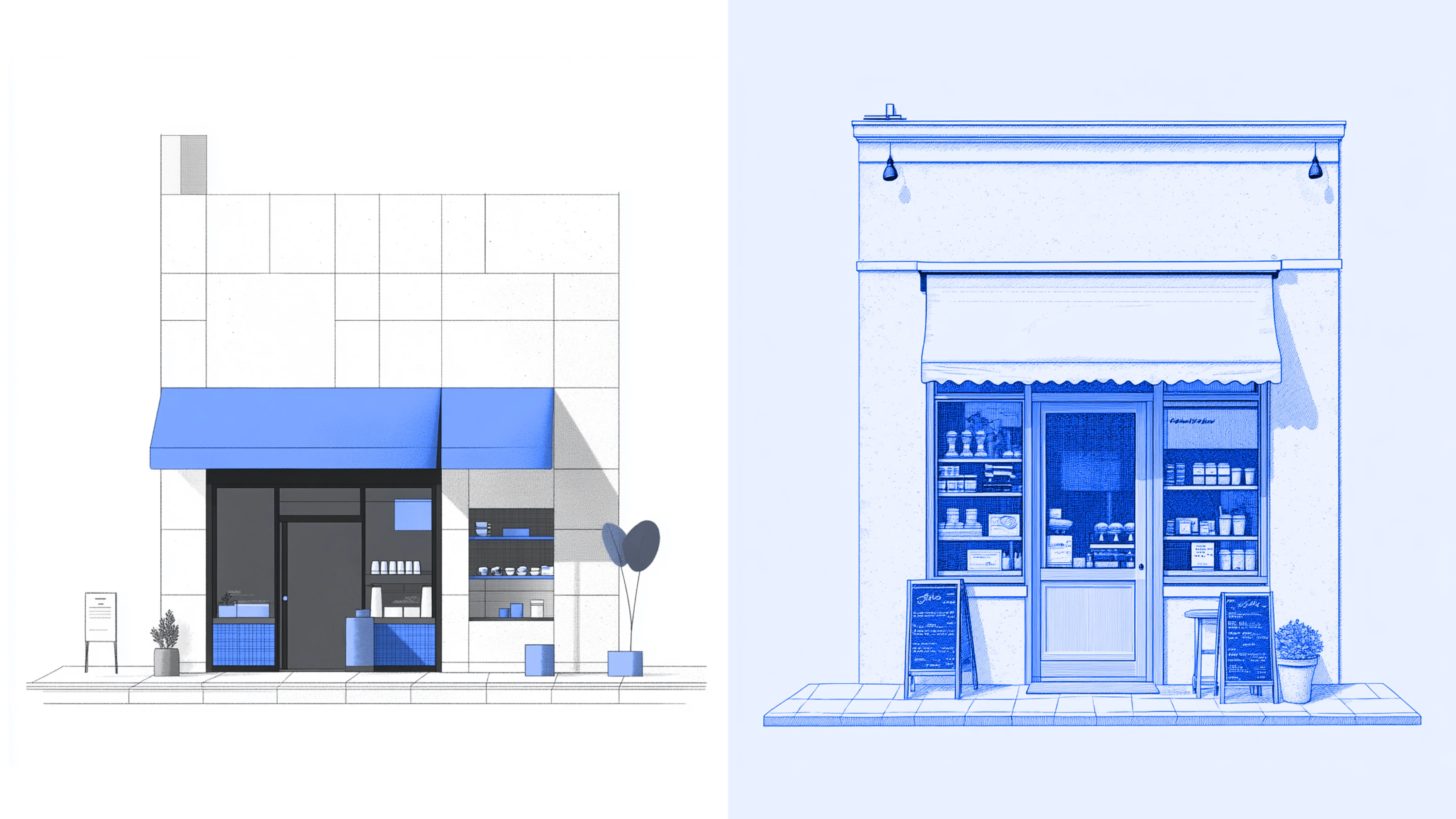
Base Café Logo Design
Base Café is an IP under Base India, the Indian chapter of Base. Its goal is to spotlight builders, shippers, creators, and designers doing exciting things within the Base ecosystem. It began as a weekly livestream on X every Friday, but soon evolved into a more flexible schedule, going live whenever there’s exciting news to share or someone in the community to highlight. Here’s how I approached designing the logo and building the visual identity for this IP.
I knew I wanted the café aspect represented in the logo, so I started by exploring visuals in Midjourney. It quickly became clear that the café element needed to be subtle (hinting at streaming without feeling too literal) while also allowing the identity to easily expand into templates for future guest announcements and social posts.
I chose a classic coffee mug as the base, but wanted it to be more expressive than just a cup. My mind immediately went to cats: curious, inquisitive, always exploring. A perfect fit for the spirit of the IP. I quickly sketched a few cat poses to see what worked best.
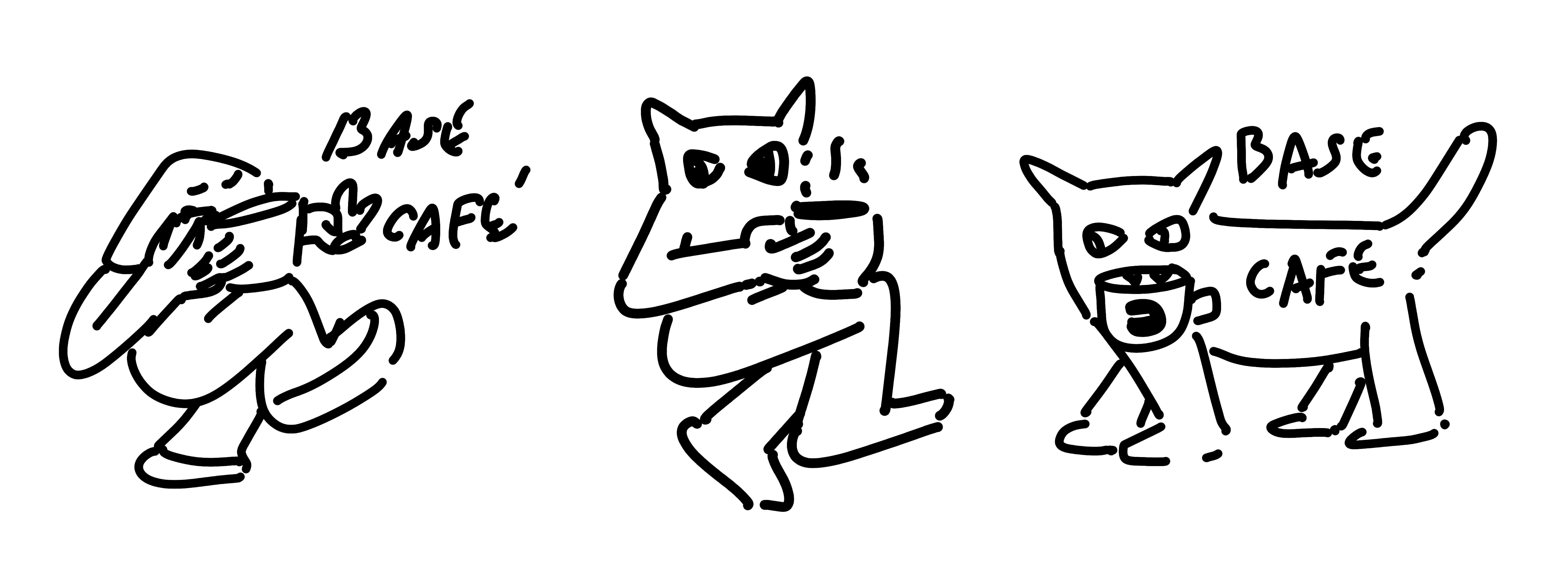
I decided the best direction was a minimal cat design holding a coffee mug,
as if intrigued by the wordmark - like, “Hey, what’s that?”
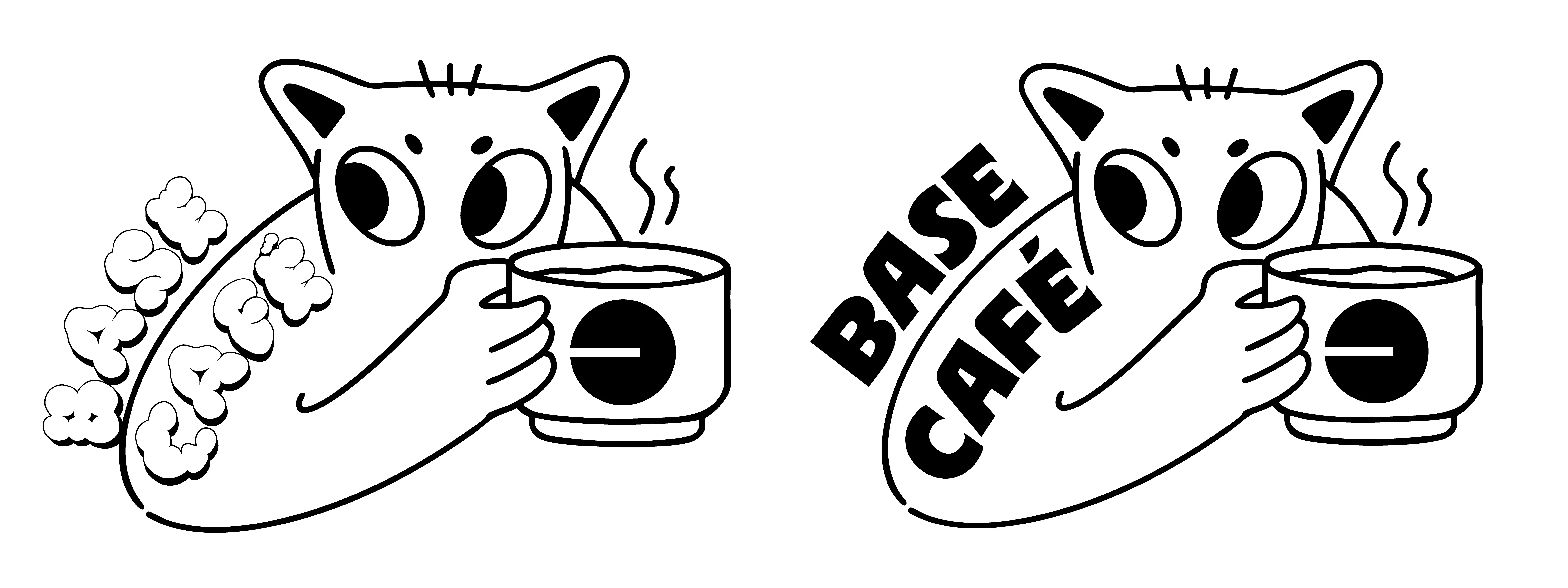
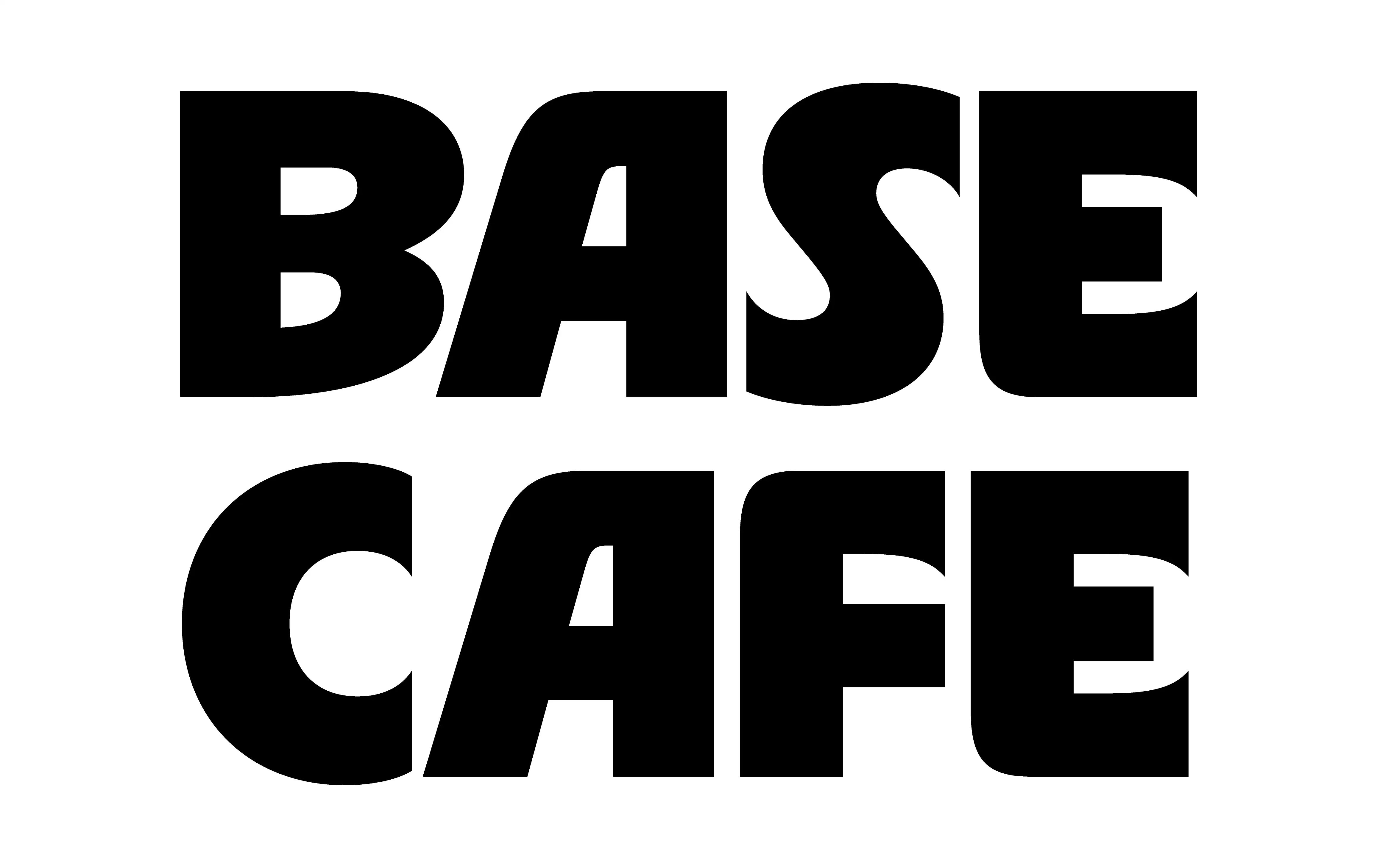
Finally, I added a small TV-box frame to bring everything together - a fun suggestion from Ahaan (from my team at the time). It was the missing piece that ensured the logo clearly conveyed a streaming IP. For the subtext, I chose BC Alphapipe as the font since its angles complemented the box’s extrusion perfectly.
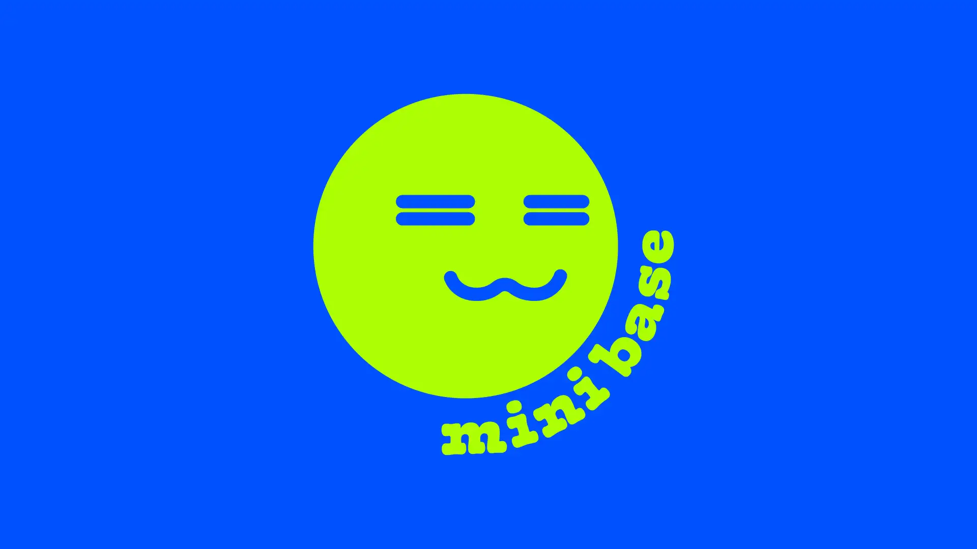
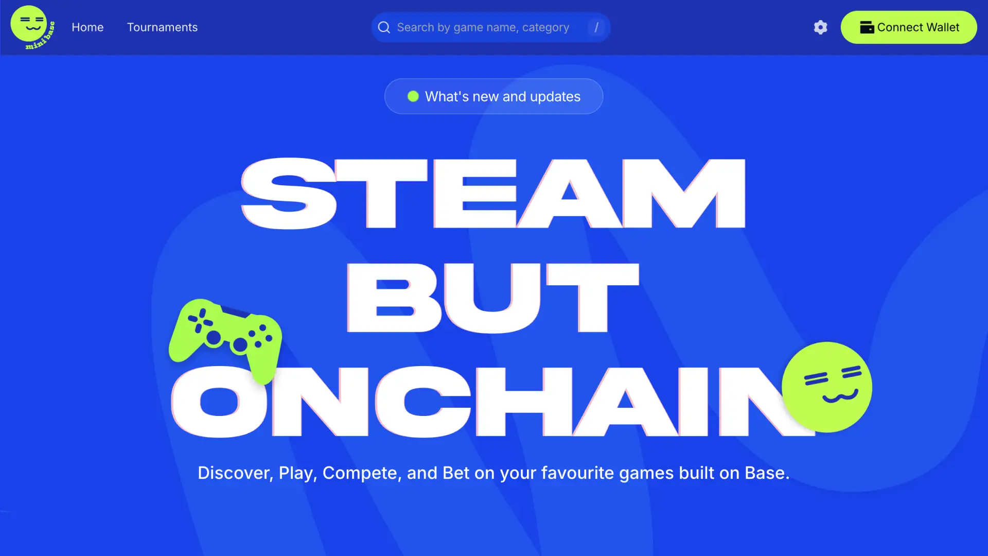
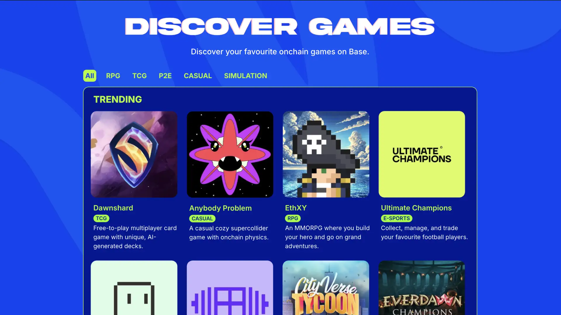
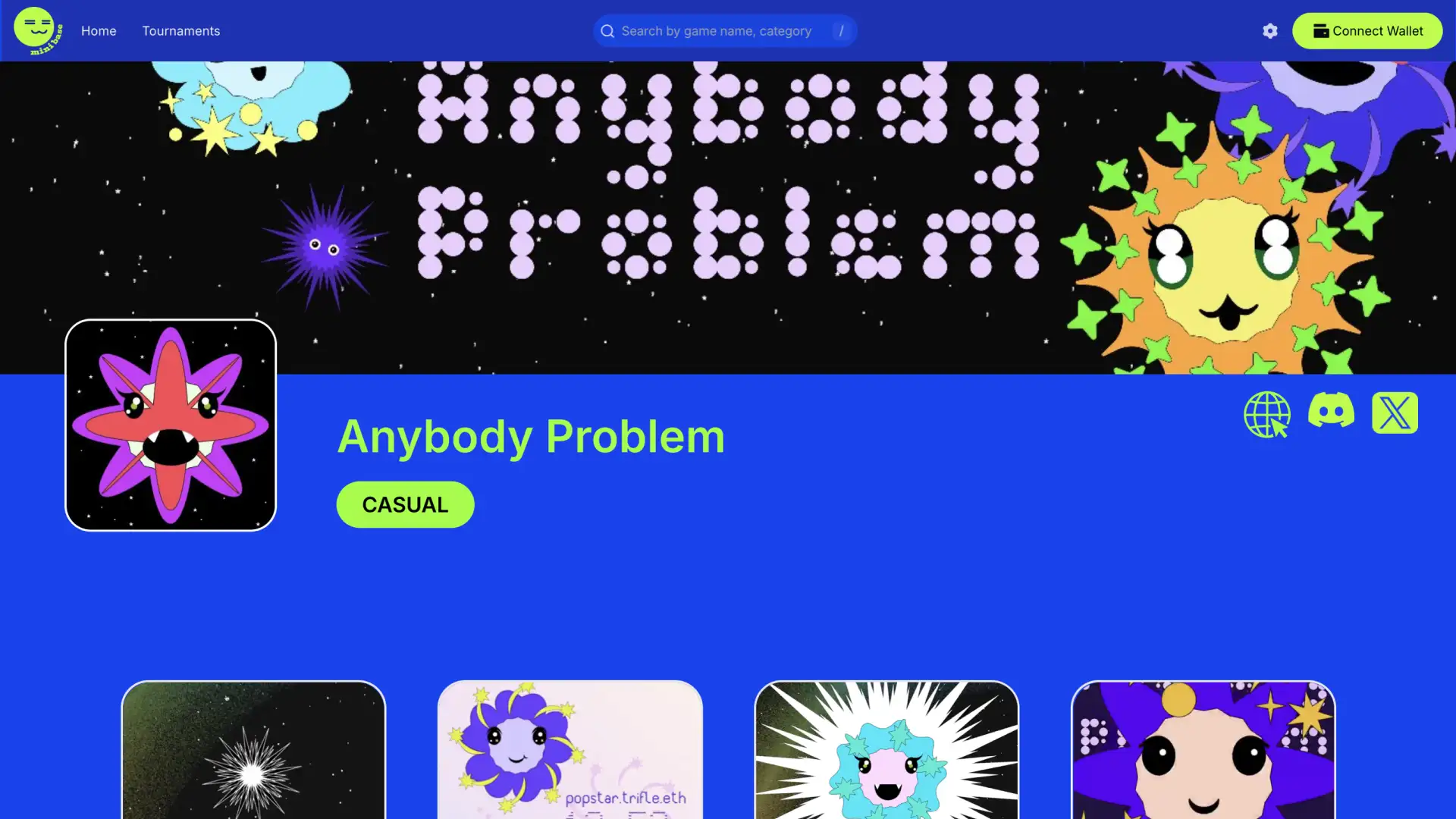
Minibase: Base Around The World India Winner
Along with an incredible team, we won the Base Around The World India hackathon. We created Steam, but for
onchain games to help with discoverability and accessibility. Along with Sumedha, I designed the logo
and visual identity for the project.
Team: Abhishek Bhagat, Ahaan Raizada, Sumedha Muralidhar & Snehal Shyamsukha